
We're constantly thinking about upcoming quarters and projections for the future. Something that we firmly believe in is decluttering and beginning a new cycle with a fresh start. Whether it’s a change in seasons or a new fiscal year, the benefits of decluttering are big.
In this post, we’ll share tips for how to clean up your BrightGauge accounts so you can work more efficiently and deeply.
BrighGauge ‘spring cleaning’ tips
Think of this as a lesson in spring cleaning, but for an app.
We all lead busy lives and when it comes to our data, we want to get what we need as quickly as possible.
Because of this, we’ve found that BrightGauge users tend to let their gauges and dashboards stack up, instead of taking some time to delete ones that are no longer used or needed.
It’s kind of like when we save every single file to our hard drive and forget to clean out some of those files every now and then. That kind of clutter serves no value or purpose to us.
There are several ways you can clean up your BrightGauge to get rid of unnecessary mess and to ensure that you’re using its features as optimally as possible. Doing this will make your BrightGauge a lot more manageable.
1. Delete what you don’t need
Make time to go through your list of gauges and dashboards and take stock of what’s still of use to you and your team.
Do you have duplicate gauges? Sometimes when we’re building a gauge, we forget that we had already attempted to create a similar one, so make sure to delete the superfluous ones.
Do you have years-old gauges? Do they need to be updated or are they totally irrelevant?
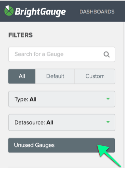
Click on your ‘Unused Gauges’, which are gauges that are not being used on any dashboards, reports, or goal lists. Is there any reason you still need these?
Look through your team members’ folders. Are there any employees who no longer work at your company? Are their gauges still being used?
2. Consolidate what you can
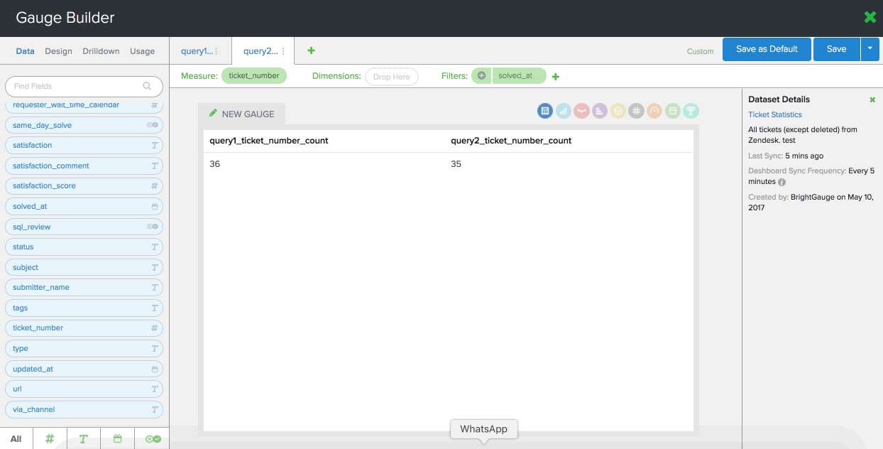
When you are in your Gauge Builder, are you configuring your gauges to look at more than one piece of data? If you’re not using layers, you may be creating more gauges than you need.
Layers are great for when you want to see a comparison in your data. For example, you may want to see how many tickets your techs have resolved this month versus last month. You’d simply create the 1st layer of ticket stats for the current month and then you’d create a 2nd layer of ticket stats for last month. The data would be displayed side by side in a column chart (or bar chart if you wish).
This is a much better use of your gauges than if you had created one separate gauge per month.
Likewise, if you’re using separate dashboards for similar data, you probably want to consolidate your metrics into one seamless dashboard. You wouldn’t want to look at Currently Open Tickets, Tickets in New Status, and Tickets Opened This Week in one dashboard and then Ticket Response Time and Tickets by Type in another. Try to put it on a single pane of glass when possible.
3. Be more efficient with your gauges and dashboards
First and foremost, make sure your dashboards are displaying only the gauges you need. Think of your dashboard like your desk. Too much clutter causes anxiety and can make you less productive. Too many unnecessary gauges on a dashboard make it harder to get the exact snapshot of data you need.
We have features that make it easy to get really specific so that your insights are sharper and more conclusive. Make sure you’re taking advantage of these.
Calculated metrics allow you to create formulas in your gauges, the way you would in Microsoft Excel (please note, you need to be on our Enterprise Plans to access this feature). As an example, you can use a calculated gauge to return your Kill Rate % by dividing Tickets Closed Today (layer 1) by Tickets Opened Today (layer 2). This saves you time and gives you a clearer idea of where you stand. Make sure your gauges are utilizing this feature when applicable.
Similarly, if you’re not filtering your gauges, dashboards and reports, you may be looking at excessive or non-specific data. There are 4 filters you can limit your data by: date, text, number, and boolean. A common example is to take a metric or KPI and filter it by technician, so you can evaluate their performance in a streamlined manner. This is especially useful if you have lots of direct reports.
Pro ‘spring cleaning’ tips:
- Use linked filters to edit the same filter across multiple gauges. Read about how to do that here.
- Exclude filters from your dashboards and reports when you need to. Read about how to do that here.
4. Disconnect datasources you're no longer using
If you still have access to a datasource that integrates with BrightGauge, but you aren’t really using it anymore nor do you plan to in the future, just get rid of it! No sense in holding on to something you don’t need.
5. Automate your reports
So many of our clients tell us that our client reporting feature has been a complete game-changer. It is so easy to create custom, interactive reports in just a few minutes. But, make sure you’re taking full advantage of this feature.
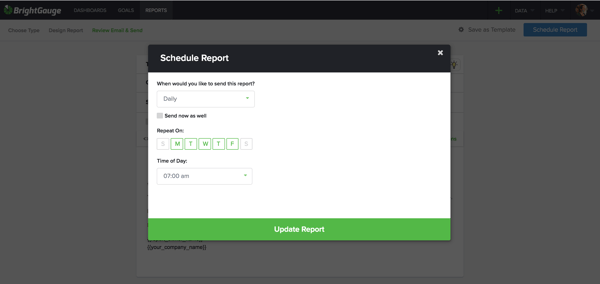
Once you’ve created a report once, you can save it as a template, and you can schedule it to go out on a recurring basis to the exact recipients you want, on the date and time you choose.
This is perfect for daily, weekly, or monthly reports that you need to send to various clients. Recipients can’t see who is cc’d on reports, so no need to worry if you’ve got multiple people receiving the same report.
6. Set up your client mappings
Make sure you’ve got your client mappings properly set up. We can’t stress enough what a huge time saver this can be for you.
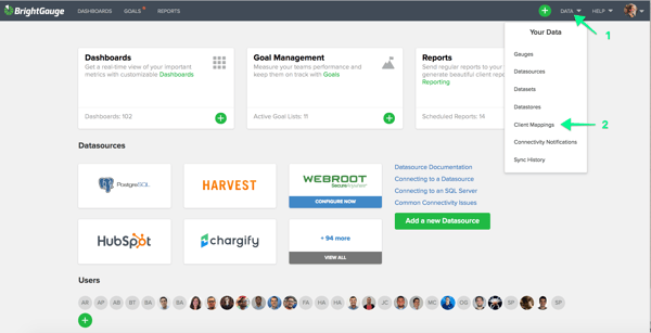
This is great to do if you integrate with multiple datasources, but your client names appear slightly differently across those datasources. Client mappings help you tell your data who’s who, which is of significant value when you’re sending lots of reports out!
Here’s a client mapping video to make sure you’ve dotted all your i’s and crossed all your t’s.
7. Archive old goal lists
We know how exciting it is to hit your goals and have an amazing quarter. Kudos to you when this happens. But instead of holding on to the past, work towards the future! Archive or delete the goal lists that you are no longer using and make space to absolutely crush new goals.
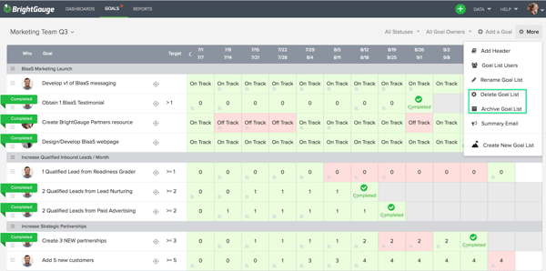
At BrightGauge, we only keep up goal lists for the current quarter. Makes it easier to focus on the current task at hand.
Being organized will make a huge difference down the line
You might think you don’t have enough time to go through a ‘spring cleaning’, but trust us when we tell you that it’ll save you a ton of time later on. Plus, you’ll be working within BrightGauge much more efficiently, which will make data insights and analysis a whole lot less overwhelming.
It’s worth dedicating time to this so you can head into each day a bit tidier and a lot more prepared.
For more tips on cleaning up your BrightGauge, check out our webinar, 'Best Practices for Organization and Account Cleanup'.

Free MSA Template
Whether you’re planning your first managed services agreement, or you’re ready to overhaul your existing version, we've got you covered!