
As a BrightGauge user, you probably have multiple datasources you connect with. Many MSPs use a PSA like ConnectWise, an RMM like Datto, and a financial tool like Quickbooks to stay on top of all their important metrics. BrightGauge simplifies the way you monitor your data by putting all these metrics in one easy-to-access place.
But did you know that, with BrightGauge, you can actually combine data from your different integrations into one super-powered gauge?
It’s called data mashup and it’s pretty good if we do say so ourselves.
What is a data mashup?
The data mashup feature allows you to combine multiple sets of information and display them together for easy comparison. The first thing you should know is that this feature is only available to our users on the Enterprise Plan (if you want to upgrade your plan, here’s how to do it).
The second thing to note is that there are two types of mashups: dataset and datasource.
How do I create data mashups?
The method for making a data mashup varies depending on whether you're mashing up datasets or datasources.
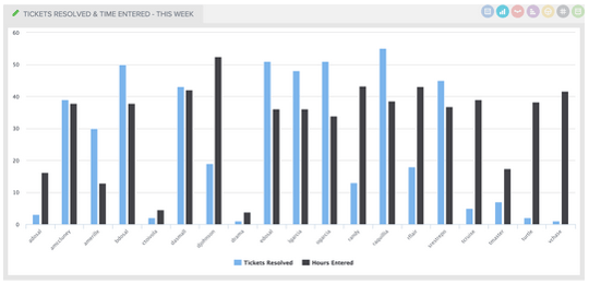
Dataset mashups let you combine two or more datasets into a single gauge by layering the datasets together. For example, perhaps you’d like to see how many tickets each technician is resolving and how much time is being entered by that technician. That’s a dataset mashup that puts those metrics side by side.
Here's an example of a dataset mashup:
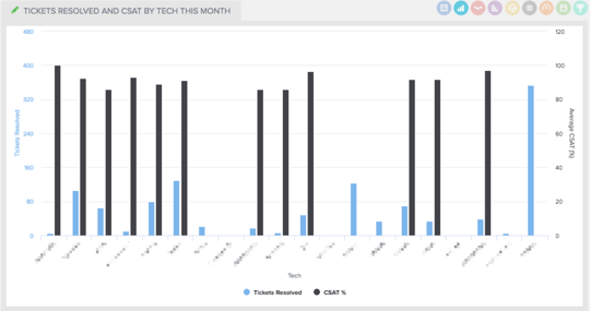
Datasource mashups are really similar to dataset mashups, but are pulled from two or more sources. Let’s say you use ConnectWise Manage and SmileBack. The data mashup feature would allow you to pull in metrics from both of those tools into one seamless gauge. When monitoring something like Tickets Resolved and CSAT by Tech, this feature is essential.
Here's an example of a datasource mashup:
BrightGauge makes it easy to create both dataset and datasource mashups by allowing you to easily define different datasets and/or datasources to combine. Simply select the datasets or datasources you want to use and plug them into a single data dashboard.
The bar charts shown above are only one type of data mashup display. Depending on your needs or preferences, you can also create funnel charts, dials, circle graphs, or many more displays.
What are the benefits of the data mashup feature?
Combining your datasets or datasources will allow you to gain more powerful insights than if you were to track each piece of data separately. In some instances, it can even give you insights that you would not have seen without mashing up your data. Anything that makes your dashboards even stronger is going to help you make better business decisions that impact your bottom line.
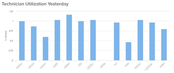
Above, we showed you what it would look like to see tickets resolved versus hours entered by technician. As a business manager, imagine using this gauge to make decisions about your team’s performance. You could use it to track multiple aspects of an employee's performance, then use that information to help them improve their productivity. For example, you could pull some ticket statistics and member data to create a technician utilization chart:
An example of how to use a data mashup
You may discover that one technician’s ratio of hours entered to tickets resolved isn’t adding up. They’re entering way too much time but not resolving many tickets within that time frame. Armed with this insight, you could approach that technician to see if something is going on that’s preventing them from answering more tickets. Or, if this is a pattern that’s developed over time, you may discover that this technician is no longer a right fit for your team. Or, you may even find that your team is overloaded and you need to add another member to your team. It's possible that this particular employee is being made to handle extra-complicated issues because that's their field of expertise and others can't handle it—leaving them to handle more time-consuming tasks than their peers.
These are insights that you simply may have missed had you been tracking the data separately. By combining data in a data mashup, you can more easily identify these kinds of issues. This allows you to take the appropriate action to improve your team's efficiency, productivity, and results.
BrightGauge data dashboards were designed to help you make sense of your KPIs and to help you make better and faster business decisions. Data mashups are like a dashboard superpower that make you an even stronger business leader.
You can upgrade your plan today to gain access to this great feature.

Free MSA Template
Whether you’re planning your first managed services agreement, or you’re ready to overhaul your existing version, we've got you covered!