
So much data, so little time.
You hear about it a lot lately, in business publications, social media, maybe even in some of your company meetings... but what is data visualization, and why are so many companies now looking to jump on board with a visual solution?
Businesses today are moving faster than ever, and running any successful company means making decisions that will best benefit the business in the long term. Hopefully those decisions are made using data instead of gut feelings, but data can present a problem of its own. Most companies have tons of data at their fingertips and running reports is not only time consuming, but it can also be overwhelming to compare trends in the data at hand.
Take my own recent experience digging through a pile of information that I needed to sort quickly. I was working on some new marketing content with our CEO, Eric, when the conversation turned to the best channel we should use to reach our community. He asked me to pull the stats to show our most popular avenues - email, podcast, social media, etc. You may think this would be an easy task, considering we’re a data company and all, but like so many of you have probably experienced I hit the wall of what we call a data silo. Our marketing platform, HubSpot, unfortunately doesn’t offer much in the way of charts and dashboards (although we still love their product). So there I was, creating a list, exporting the data to CSV, and then importing the CSV into a spreadsheet so that I could make a nice pie chart to share with Eric. What a pain! Fortunately for me this time, I was only pulling the data behind one topic, or else this project could have taken ages.
Why do visuals even matter?
After the nightmare of all the shuffling from one software to another, it would be easy to lose sight of why making that pie chart was so important in the first place. Using graphic images or charts to present data isn’t just about a sweet-looking way to decorate your walls and represent numbers. It’s also the best way for a human brain to analyze and comprehend the numbers as seen before it. By placing data in a graphical form, the end user can easily understand the significance of the data before them, compare multiple pieces of data or even set goals and objectives based on the data. In fact, here are a few stats to help us explain just how important visuals are when it comes to interpreting data:
- The human brain can process entire images that the eye sees for as little as 13 milliseconds (source: MIT neuroscientists)
- About 80% of the information we take in is by eye (source: TED study on Visualizing Data)
- The human brain processes visuals 60,000 times faster than words (source: Dr. Lynell Burmark)
But that’s not all. Data visualization is not only the fastest way to show data, it’s also a key factor in the impact and recollection factor. According to Forrester research, “When we hear a piece of information, we remember 10% of it three days later; if we add a picture, we remember 65% of it.” Now that’s a stat worth remembering!
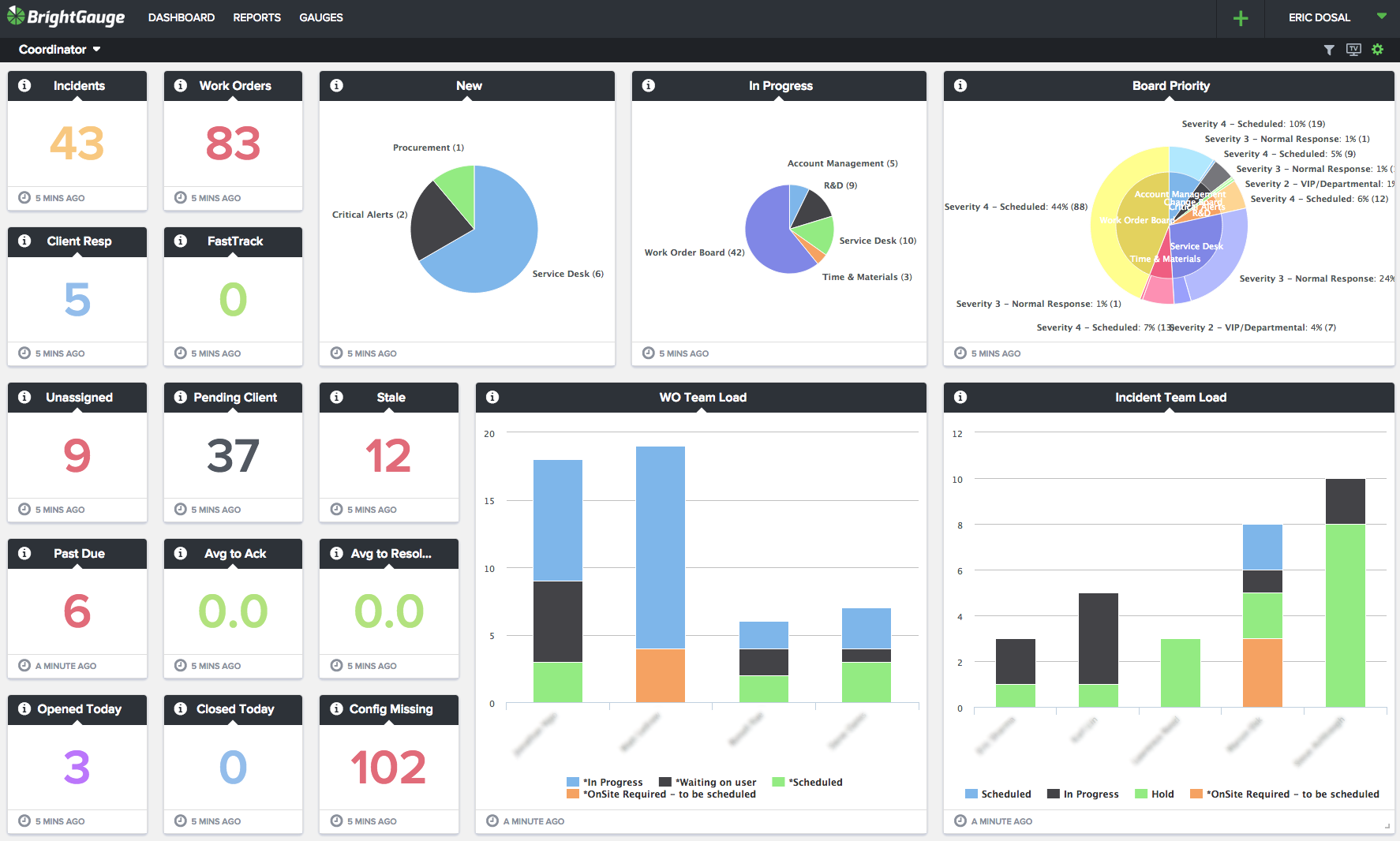
 visualizing Service Coordinator results in dashboard form is the easiest and fastest way to comprehend the data
When it comes to the best way that you can manage and grow your business, start by making sense of your data. Use a visual solution to translate trends into business intelligence that’s easy to understand, and if you have questions about how to better manage your data, reach out to our team to learn more.

Free MSA Template
Whether you’re planning your first managed services agreement, or you’re ready to overhaul your existing version, we've got you covered!

