Clients are the bloodline of your business. You exist because of them. Your team works because of them. You set quarterly goals because of them. However, this doesn’t mean that they fully know ...
Clients are the bloodline of your business. You exist because of them. Your team works because of them. You set quarterly goals because of them. However, this doesn’t mean that they fully know everything that goes on behind the scenes at your company. And, while they may not need to know everything, they do need to know what’s going on with their account. This is where client facing dashboards come in really handy. So sit back and read about best practices for these types of dashboards, ‘cause it’ll make the process a lot easier for everyone involved. Quick Links What Is a Client Facing Dashboard? Why Are Client Dashboards Important? Dashboard Design Best Practices (+Examples) 5 Things to Consider When Creating Client Facing Dashboards Choosing the Right Dashboard Tools What Is a Client Facing Dashboard? As the name states, a client facing dashboard is an online document with business intelligence in which you add your B2B client as a viewer. They can then create an account with their own login credentials. However, they will only have access to see the information that’s displayed. They typically don’t have any additional permissions. Why Are Client Dashboards Important? Client facing dashboards are important because communication is crucial to build long-lasting relationships with your clients. Not only do they foster transparency, they also showcase elements of your work that they may not have been familiar with — yet are necessary for them to conduct their business. Specific examples of what you can use these dashboards for include: Marketing campaign performance Project timelines Cybersecurity trends and risks Depending on the purpose of the dashboard, they may also make it a lot easier for your team to handle their workload, since customers would be able to log in to check data instead of having to regularly call in. This is the kind of interaction that provides tangible value and turns existing clients into repeat customers. Dashboard Design Best Practices (+ Examples) Ok. So client dashboards aren’t really the eighth world wonder — but they can be if you are mindful of industry best practices. 1. Keep It Simple The single biggest piece of advice that we give to clients when setting up their BrightGauge dashboard is to keep it simple. While it might be tempting to load every important metric into a dashboard, it is best to focus on only the most essential information. We advocate for a 5-second snapshot rule. At a glance, your BrightGauge dashboard should let you know where attention is needed in 5-seconds or less. By placing only the most important and relevant gauges on one dashboard, you’ll quickly have a better understanding of where you stand. However, keeping it simple doesn’t mean you need access to less data. There are likely many data points that you need to analyze to gain a complete picture. When you need more data, you can use the rotate feature to view additional gauges that are relevant to your dashboard. Remember, you are never limited to a single dashboard, so try to group metrics with each other based on relevance. 2. Keep the Viewer in Mind When deciding which gauges to include on your dashboard, consider who will be using the dashboard most often. What role does this dashboard viewer cover? What metrics will they need to do their job? Which metrics won’t be needed so often? Work directly with your teams to determine which metrics they access most in their daily work, and include those gauges on your main dashboard for that specific role. As for deciding the number of gauges to include on a dashboard, we recommend choosing seven. Why seven specifically? We call all the way back to a study from the 1950s that showed that seven objects was the average capacity for the brain's working memory. Providing more metrics might provide more information initially, but will they retain that information? Don’t overwhelm your teams with a page full of numbers. Instead, focus on keeping relevant information together and try not to exceed seven gauges on any single dashboard. 3. Choose the Right Gauge At BrightGauge, we know each of our users are unique, with different likes and preferred styles. For that reason, we offer several different gauges (e.g. charts or diagrams) to choose from. The gauge style that you choose should be influenced by the metric that the gauge will be displaying. Remember that certain gauge styles lend themselves well to certain types of metrics. For example, here's a look at the same Server Patch Status data, but shown as a pie chart, bar chart, and a table: Choosing the wrong display style can misrepresent the data in the eyes of the viewer. Consider what you want to learn from each specific metric. For instance, a pie chart wouldn’t be a wise choice for comparing daily support ticket metrics among dozens of service reps as it would be jumbled and difficult to read. Selecting the right gauge type is important for interpreting and analyzing data, but if you pick a style now and decide to change it later, you can easily update your choice with a couple of clicks. 4. Design Logically The English language and most other modern languages read from left to right. Most of us have been reading from left to right since we started elementary school. Our brains are wired to seek out information in that way. You can see this concept reflected in eye-tracking studies, where “F” patterns seem to dominate digital reading patterns. Most people will read through digital information the same way that they would a book — from left to right, all the way down the page. So, design your dashboard with these things in mind. Put the metric that you would like to read first at the top, left-hand side of your dashboard. Place other metrics in order of importance from left to right, moving down the page. 5. Review Regularly The beauty of a BrightGauge dashboard is that nothing is ever set in stone. You can change the layout of any dashboard at any time. Are you finding that you are not paying much attention to a specific gauge? Remove it and replace it with a more useful one. Have your metrics priorities changed? Shuffle your gauges around to reflect your most important metrics. Every few months, you should re-evaluate your current gauge layout and determine if it’s in line with your priorities. Don’t be afraid to try out new things! If you find that a decision isn’t working for you, you can always revert to your previous design. 5 Things to Consider When Creating Client Facing Dashboards So now that we’ve gone over some examples, there are a few other things you want to take into account when creating client facing dashboards: 1. Your Audience Who’s reviewing the dashboards? Because they will look very different if you’re preparing them for a data analyst or for a stakeholder. Make it as easy as possible for them to navigate and understand the information; and only go into details if their job role requires them to be aware of additional information. 2. Customization Always ask your clients about their preferences. What do they want to see first? What type of chart or graph makes it easier for them to understand data? What’s their preferred layout? Do they want specific colors in the dashboard legends? The customer is the star. Build the dashboard around them. 3. Interactive Elements While static reporting can be useful, interactive features can be more efficient, since they can allow users to do actions such as filter, compare, link data from spreadsheets, and see real-time updates. This makes it a lot easier for customers to fully visualize data within context. It also saves them the time it would take to update everything manually. 4. Which KPIs to Track Include the most critical data points to achieve your client’s goals. This will vary depending on the type of dashboard you’re creating. For example, if your customer wants to track their sales cycles, KPIs to include may be the number of leads in the pipeline, cycle length, customer acquisition costs, and revenue. Don’t go too crazy throwing in everything and the sink. You can always create additional dashboards if the main subject branches too much. 5. Integrations Every single one of your customers is already using different softwares to help them run their business. Use dashboards that integrate well with the tools they’re already using. Let’s take this moment to point out that BrightGauge dashboards integrate with over 40 software platforms and it’s part of the ConnectWise ecosystem. Choosing the Right Dashboard Tools Creating effective dashboards doesn’t have to be as time consuming as it sounds. With the right tools, like BrightGauge, you get powerful reports out to your clients whenever you want. Some of our partners have reported that our tools have saved them 8-10 hours per week, which is time they can now spend focusing on revenue-generating tasks — or on doing some fun stuff with their loved ones after a long day at work. For an in-depth look at the BrightGauge dashboard technologies and other features, please contact us so we can set you up with a live demo.
With big data comes big data responsibility. Simply collecting large amounts of data isn’t helpful in and of itself. To use data to its full potential, it is vital that companies have strategies in place for collecting, storing, managing, and utilizing that data. Unfortunately, many MSPs often place too much focus on collecting data and too little on getting the most out of it. The earliest attempt to define the essential attributes for big data management came from Gartner in the late 1990s. Their system, known as the “3V’s Framework” provided an outline for understanding and managing data assets. As time has gone on, other companies have expanded upon their framework. Today the most commonly referenced big data management attributes feature a fourth V: Volume Velocity Variety Veracity Every organization collects data from a range of different sources. Those sources often include transactions, content, and internal data among others. The 4 V’s provide a framework for leveraging and maintaining that data to produce superior value. Let’s take a deeper look at each of the 4 V’s and examine how MSPs can analyze them to achieve superior results. MSPs and Data Volume When discussing big data, analysts use the term volume to describe the amount of data involved in the process when considering all the different possible data sources. Pound for pound, there are few types of companies that collect more data than MSPs. Not only do they collect a lot of internal operations data, but they are often responsible for their client's data as well. According to IBM, 90% of today’s data has been created in the last 2 years. It’s easy to see why data volume can quickly become a serious concern. That concern isn't just for storing large amounts of data, but for accessing, managing, and effectively using that data. The volume of data a business produces on a daily, weekly, or monthly basis can be overwhelming. Not only does your team need to manage traditional data points, like tickets opened, employee time, and sales deals closed, you may also need to keep track of and monitor any data created by social media networks. Additionally, considering any historical data you may have on hand, curating information from employee reports, customer logs, and other sources gives your team a long term look at trends and patterns. Having more data sources to analyze allows you to explore and create a bigger picture but challenges your team to create and manage both a storage system for this information and a user-friendly system for analyzing and explaining these data points. MSPs and Data Velocity The term velocity is used to describe the rate at which data is processed and the pace at which the data flows from the customer or consumer to the management team. With the widespread use of computers and the introduction of mobile technology like tablets and smartphones, the flow of data can be overwhelming. In addition to traditional means of interaction, like phone calls, surveys, and emails, customers and clients are leveraging the power of social media in order to be heard, creating an almost continuous stream of data. MSPs in particular often deal with rapid influxes of data, and it can be overwhelming if you don’t have a system that allows you to store, categorize, and filter incoming data on a real-time basis. Being able to filter out some of the “noise” and focus on the information that helps you streamline your decision making process is critical in order to identify potential problems, and implement solutions and alternatives well in advance. MSPs and Data Variety In the context of big data, variety is used to describe both the different types of data as well as the different sources it comes from. Management analysts and experts often tout that businesses “can’t manage what they can’t measure”, meaning that you can only be accountable for the data and processes that are available to you at any given time. With the influx of new data provided by social media and mobile technology as well as traditional data generated by your clients and customers, the sheer variety of your data can cloud your management picture. There are two varieties of data that businesses collect: Structured data: refers to data types that have a meta model for storing and filtering results. Structured data includes things like bank statements, transaction logs, and usage logs. Unstructured data: refers to data that does not have a consistent meta model and could include examples such as social media updates, web pages, and web logs. Unstructured data is the largest driver of rapid growth in data collection. The best way to address data variety is to streamline your information into one singular view so that your managers have a clearer picture of what’s happening with any client or customer. MSPs and Data Veracity Data veracity refers to the trustworthiness of the data collected. Companies with high-volume data operations are more likely to suffer from low-quality data. In turn, business decisions made based on bad data are unlikely to result in the desired outcome. On a big-picture scale, it is estimated that poor data quality costs the US economy up to $3.1 trillion every year. Translated to the MSP industry, high data volume and variety are commonplace, and because of that occasional data abnormalities are unavoidable. The most important thing to remember about veracity at your MSP is to take the time to clean up incoming data and filter out that of poor quality. Maintaining clean, reliable data is critical for the health of your business since your data is the foundation of your decision-making process. How to master the 4 V’s of Big Data There is a lot to consider when attempting to improve your data operations. The 4 V’s - volume, velocity, variety, and veracity, encompass the most critical demands of effective, data-driven decision making. Learn more about how to successfully manage big data using BrightGauge in our free white paper:

As a Customer Service Manager, your goal is to increase client satisfaction, but it can be difficult, impossible even, to improve your client's happiness without utilizing data. One of the toughest parts of using data, is knowing what data to use in the first place! If you’re measuring the wrong metrics on your customer service dashboard, you may be tricking yourself into thinking that your team is working efficiently, your clients are satisfied and your goals met. That’s why it’s so important to be tracking the correct metrics. By using one of our best practice templates when setting up your dashboard, you can ensure that you have all of the gauges that are necessary for service success. Let’s take a closer look: 1. Tickets Opened Today By monitoring the number of tickets opened today, you can know within seconds how big of a workload your team has. This data allows you to ensure you have enough staff to handle the incoming tickets and can help you identify and react when something happens that causes the number of support tickets to spike. 2. Tickets Closed Today This metric gives you an idea of how efficiently your team is performing. If the number of tickets closed today isn’t consistently keeping up with the number of tickets opened, you may need to consider hiring more staff or changing some workplace practices to increase team performance. 3. New Tickets Important for tracking SLAs, the number of new tickets allows you to see how many tickets are waiting to be assigned. These are tickets that haven’t even been looked at by a technician, and if you’re following best practices this number should aim to be 0 at all times. If you notice that this number isn’t at zero your average time to response is increasing and you need to address it! 4. Assigned Tickets Assigned tickets are the tickets that have been responded to and are already assigned to a technician. These tickets are sitting in the person’s queue and serve as another indication of how you are doing in terms of your SLAs. If the number of assigned tickets is too high, then your average time to resolution plan is increasing. 5. In Progress Tickets If you monitor the number of tickets that are currently in progress, you’re actually checking the performance in relation to another key metric: average time to resolution. The number of tickets in progress also gives a good indication of how well your team is performing. 6. Resolved Tickets Resolved Tickets is the last metric that contributes to your SLAs. In most cases, this is the best of the SLA metrics for measuring performance. This indicates the number of tickets your team has resolved today. 7. Unassigned Tickets With unassigned tickets you start measuring the metrics that will allow you to manage by exception. Ideally, this number is always at 0. If there are unassigned tickets, you’ve got a problem because if a customer responds, no one will see the ticket and it will go unresolved. This allows you to quickly identify one of these situations before it occurs! 8. Customer Responded Tickets This is another metric you’ll always want to be at 0, because if not, it means the customer has sent a response, but your team has not yet seen the reply. Ideally you’ll always send the last word as it contributes to a pleasant customer experience. Tracking this number allows you to see when that’s not happening, giving you the power to look into why your team isn’t responding to your clients. 9. Waiting on Customer Tickets By tracking tickets that are waiting on a customer response, you are able to follow up with what could be a potential issue. Typically, tickets fall into this category when a customer hasn’t responded in over 3 days. It could be a sign that they didn’t receive the response or maybe they are on vacation and you need to reach out a second time. Either way, this allows you to know when it’s time to follow up on tickets. 10. Tickets Past Due Tickets that are past due typically have a certain time and date assigned to them, and for whatever reason they were not resolved during that window of time. This could be a result of a ticket that has been resolved but isn’t marked properly, or it could be a true case where the work hasn’t been performed on time. Either way a great indicator of tickets that need immediate attention and may require resetting expectations with the client. 11. Currently Open Tickets by Type Usually presented in the form of a pie chart, currently open tickets by type will show you areas where your team may be struggling and will need to focus on. It also allows you to identify trends that contribute towards the number of tickets being submitted, allowing you to create a strategy to cut down on the number of tickets you are receiving. 12. Stale Tickets Stale tickets are tickets that haven’t been updated in 7 days. This metric is both a manage by exception metric and a compliance metric. This number should be at 0 at all times. Best practices say that a ticket should be updated within 7 days at the latest, so if you’ve got stale tickets you need to find out why and how you can stop them. 13. Average Time to Respond - Last 14 Days Average time to respond is the amount of time it takes to go from new to assigned. The lower the better - if you’ve got a high number here, finding out why should be a priority. 14. Average Time to Resolution Plan Your average time to resolution plan is the amount of time it takes for your team to start working on the ticket (In Progress status). If this number is high, it’s possible that your technicians have too many tickets in their backlog and they need an extra hand. Typical best in class companies aim to keep this number under 4 Hours. 15. Average Time to Resolution Average time to resolution shows how long it takes for a ticket to get resolved. This provides insight into how quickly your team is solving problems. Typical best in class companies aim to keep this number under 8 hours indicating that on average all issues will be resolved “same day”. 16. Tickets Opened and Closed - Last 14 Days An overview of your tickets opened and closed in the last 14 days allows you to quickly see whether you’re ahead or behind. It also allows you to check for trends such as days where your team is not as efficient, or days when abnormally large amounts of tickets are submitted. What’s Next? Now that you know 16 metrics for your Service Management dashboard, keep the momentum going with Dashboard Best Practices: a webinar recording of the fundamentals that we see our most successful customers using to drive efficiency with data! You’ll learn: Top 5 rules for designing dashboards Most popular dashboards for Service, Sales, Management, and Finance Building the right client dashboard Driving competition the right way Management by exception Increasing transparency & efficiency About dashboard features: rotation, filtering, etc. and much more!
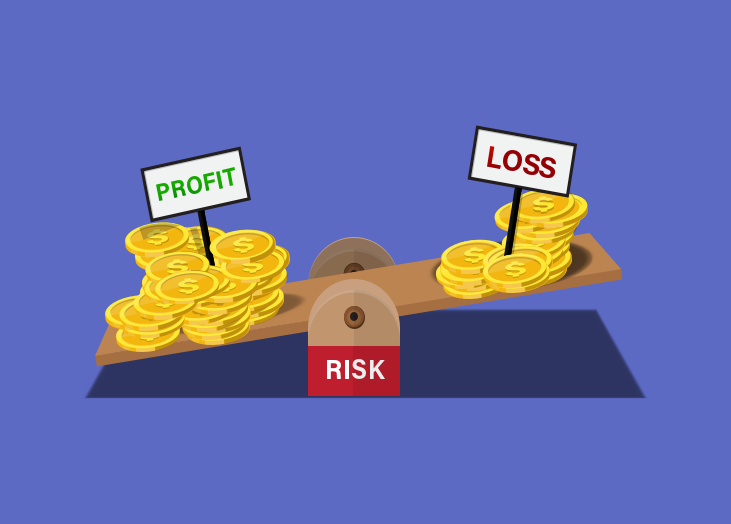
Many businesses are basing their operations decisions on their profit and loss statements (P&L) to become “data driven”, but if you’re using a P&L to predict your business’s performance and success, you could be setting yourself up for failure! Let’s take a closer look at the problems with P&L, an alternative to use, and how to set your business up for success. We’ll start by discussing the shortcomings of P&L. What P&L statements lack Profit and loss statements are flawed because they recap after the fact, otherwise known as a lagging key performance indicator. Everything the statement shows is in the past, and it’s too late to make changes by the time you get it. This results in a few key issues: You can’t identify negative trends fast enough which makes it more difficult to reverse the trend. You are running your business and making decisions based on data that is, by now, already outdated. This can lead to a negative operations cycle: you make a bad decision based off of outdated information, which in turn causes you to make more bad decisions. P&Ls only focus on financial data, which limits you in two major ways. First, you don’t get the big picture and could miss out on some key trends that indicate a performance increase or decrease. Second, you don’t have any clue what is causing your business to be more (or less) successful. Let’s face it, if you’re using a P&L, you need to switch to another form of performance measurement immediately to ensure your business is successful and performing at its best. Going beyond P&L: how to keep a real-time view through goals Goal-setting isn't a new concept, but has been growing in popularity lately. Goals are part of a strategic planning and management system that was created with the intent of providing a more “balanced” view of business performance. Goals differ from profit and loss statements in that they include non-financial measures and provide faster updating data. Using BrightGauge goals gives a true indication of business performance and provides a more real-time view of what’s happening in your business, better known as leading key performance indicators. The best goals combine financial data, along with other KPIs such as customer feedback and service team performance for a complete business view. 5 powerful benefits from using Goals instead of P&L Better performance in every area of your business. Ability to easily implement, track, and adjust your business strategy. An accurate measure of business performance. Ability to identify gaps in your strategy. Reinforcement of management best practices. At BrightGauge, implementing Goals was one of the main factors behind our 60%+ growth in 2016. By using Goals for each one of our teams, it was easy to align all departmental targets with that of the company’s overall KPIs. Once each team knew their target, it was easy for them to measure their progress every week. And not only did we use Goals on a team basis, we were also able to track each individual's performance towards hitting their target. With each person having their own goal to update on a weekly basis, the accountability factor really pushed everyone to give their all. After all, nobody wanted to see their KPI progress in red when compared to the rest of their team! Are Goals and Dashboards the same thing? Goals may seem similar to dashboards, but there are big differences. The purpose of Goals is to help you track your progress towards your specific KPI. Goal cards makes it easy to see when a particular KPI needs more attention when you’re falling short, while on the other hand, it's also simple to see which areas just need to be maintained because KPI progress is on track. A dashboard’s main purpose is to let you easily compare data points across your business from various sources. Think of it like a dashboard in your car. You have all kinds of things to measure there. Your odometer gauge tells you how many miles you’ve traveled, while your speedometer tells you how fast you’re moving, your tachometer measures your engine’s RPMs, and the list goes on. Your car dashboard is an information and monitoring system, and that’s exactly what your business dashboard is - they just show you different kinds of information. So while your dashboard could include KPIs, it should also include metrics that help you manage your day to day business, such as the average time it takes for your service team to acknowledge a ticket, or the amount of workstation disk space being used across the networks you manage. Gain a real-time view of your business performance Rather than keeping track of what’s already happened in your business, your P&L needs to be traded out for a Goals card instead. Once you and your team can see a real-time view of how each action positively or negatively affects your progress towards your goals, it’s so much easier to get on track and stay the course towards meeting your organization’s KPIs. Learn more about the right way to set business goals by downloading our free whitepaper. *Note: this post was originally published in 2017 and has been updated for accuracy.

At BrightGauge, there’s no confusion about our love for coffee. Whether we’re enjoying our 3pm colada in the office or taking a group field trip to any one of several different coffee shops around town - we’re going to consume the liquid energy in some way every single day. So, one Friday during our group happy hour session, someone asked “how much coffee do you think we really drink?” Being pretty obsessed with data is our M.O. at BrightGauge, so decided to let a dashboard speak for itself. Here’s what we came up with: Now if you keep up with most of our product features, updates and announcements, you may be asking yourself how we put together this sweet dashboard. Did they announce some new coffee integration I missed? Don’t worry - you haven’t missed any breaking news from our team! However, if you haven’t yet used our awesome Dropbox integration, let’s take a closer look at the coffee data journey and how it all came to be. First, you should know that our Dropbox integration lets us pull in any data via a CSV… so, if you’ve seen Brian’s Wine Inventory dashboard you know how easy it is to think outside the Service Provider box on ways you can use our platform. Using the same process, we decided to put together the key metrics of our coffee consumption. What data to gather The first question we asked ourselves is “what questions do we want to answer?”. Obviously we wanted to know about quantity but that naturally led to other questions we might want to know. Here are the 5 topics we came up with: Beverage Size - to help us track the most popular serving quantity Type of Beverage - to see the type of brew Location - to compare coffee consumed in office vs. at a coffee shop Time of Day - to understand when people were drinking coffee Amount of Coffee Consumed - to see who consumes the most coffee overall Getting the Data into BrightGauge We started gathering the data manually via our coffee Slack channel but that quickly proved to be too manual (although it did start some phenomenal conversations about coffee): So, we set up a Google Form to easily ask the necessary questions (you could also use SurveyMonkey), but the best part is that Google Forms will automatically drop the data into a Google Sheet. This allowed us to have the team fill out the link on a daily basis and collect the data without all the hassle of the manual process. Once we had enough data we exported it to a CSV. Now that we had collected enough data and exported to a CSV, we simply uploaded the CSV via Dropbox to BrightGauge as a dataset. That allowed me to create the gauges you see below. Making Sense Of the Data As you can see from the gauge below, Kristian is by far our biggest coffee drinker - it makes sense given that he leads our Support and we need him “on” all the time: It's also easy to see that the most popular option is to make coffee at the office and enjoy it in the company of our teammates: It also makes sense that American coffee is our most popular option since the BGS Brew (the winner from the gauge above) is American. Although, we did just get a Cuban coffee maker and so I suspect that “slice of the pie” will be increasing over the coming weeks. How Will You Apply This To Your Business? Many times you have questions you want answers to, but no easy way to gather the data and display for others to see. Whether it’s Customer Satisfaction Surveys, Employee Surveys, Manufacturer Warranties Expiring, tracking supply inventory, or anything else - by using the BrightGauge + Dropbox integration you’re able to pull that data in and begin to analyze and visualize your data. Stay tuned for more updates on the BrightGauge crew’s coffee of choice, and tell us... what fun data are you visualizing with your dashboards? *Note: this post was originally published in 2015 and has been updated for accuracy.

70+ Metrics for MSPs
Key metrics and accompanying formulas to help MSPs skyrocket growth and success!
Get your KPIs

For many MSPs, BrightGauge is their secret to success. They rally around dashboards on 60” TVs in their NOC and use reports to keep the team rowing in one direction. These MSPs have a leg up on the competition and use the enhanced insights we provide to become more efficient and profitable than ever before. Some MSPs are using BrightGauge in new, innovative ways, and are getting massive benefits because of it! Here are some of the powerful and unique ways they are using BrightGauge: 1. Reactive vs. Proactive Ticket Close Time by Engineer Kevin Studley, from The Network Pro, tracks how long it takes his engineers to close tickets by type. Most MSPs use this metric to identify coaching opportunities, but Kevin goes further: By looking at which tickets are closed fastest, Kevin is able to find the best team for each engineer. These days, engineers at The Network Pro spend 15 minutes less on each ticket, saving him 3 hours a day per engineer (on average). 2. Technician Dashboards Kevin uses technician dashboards to keep engineers more organized and effective. Each engineer has their own dedicated dashboard which allows them to see how they are performing and what they need to focus on. As a bonus, displaying the metrics on the computer has cut back on paper usage! 3. Progress Towards Goals Brian David, from Lloyd Group, uses dashboards in a big way for their management teams. He's set up dashboards that track operations goals and revenue objectives using thresholds. Thresholds are number gauges which show whether the team is on track by turning green, amber, or red. Brian stopped needing to log in to ConnectWise once they started using BrightGauge this way. All the metrics he needs to manage the business are available right in BrightGauge! 4. Project and Team Management Brian also uses BrightGauge to handle project management tasks. He sends weekly reports on Thursday and Monday which highlight any incomplete tasks and areas which need focus. Using BrightGauge’s reports, he's been able to get his employees to be more focused and to work on the areas and tasks that are most important. If an employee isn't able to improve, Brian is notified and he can sit down to coach the employee. 5. Financial Data Will Collins, from Network Solutions & Technology, monitors almost all financial metrics in BrightGauge. Will uses BrightGauge to measure metrics like all revenue streams, employee costs, and profitability. This has helped him to ensure that their financial trends stay positive. 6. Employee Accountabilities Will also uses BrightGauge to track employee accountabilities. NST uses an accountability based bonus structure, so it's important to track every detail. With BrightGauge, it's much easier for Will to know when an employee should get a bonus. It’s also easy to identify and help employees who aren’t meeting their accountabilities. This has led to increase in employee utilization. For more BrightGauge uses, check out our Customer Case Studies. Note: this post was originally published in 2016 and has been updated for accuracy.

You have a lot of data at your fingertips, but data doesn’t mean anything if you don’t know the best way to view, sort, and categorize it. And when it comes to choosing between a dashboard or goals, you’ll notice that many times they may feature the same information. In the past, we've looked at dashboards vs. reports, and how to choose between the two, which led to some questions about deciding between a dashboard or goals. Each BrightGauge feature provides unique insights into the trends within your business, but let’s take a look at the features and best uses for each one: The Best Time to Pick a Dashboard We always say that dashboards are the cornerstone for providing a complete picture of the health of your company. Because dashboards are extremely customizable, you also have control over what data points you show, and they’re flexible when it comes to your decision on whether you provide daily, weekly, or monthly insights. BrightGauge dashboards are the perfect choice in certain situations for 7 reasons: 1. Real-Time and Right Now At the core of a dashboard’s purpose is the ability to provide a real-time look at your most important metrics. The gauges displayed on your dashboard should be customized with the KPIs that are most relevant to your operations, because you’ll be able to address them at the moment you see any metric start to slip. 2. Sync Your Teams Dashboards are perfect for ensuring that your teams stay on the same page. BrightGauge allows you to create a separate dashboard for each team, showing the most important metrics for their position. You can even create custom dashboards for multiple teams, or smaller subteams as well. Instead of relying on a single person to disseminate vital data, giving your teams access to your dashboards ensures that they always have the important information on hand. 3. Show Off Successes Dashboards are a great way to showcase your success. When your teams make magic happen, don’t be afraid to show off your accomplishment! Assign a threshold value so that your success is easily seen, and take a page out of the BrightGauge playbook... when we hit a target, we’ve been known to crank up some music and even dance around for a bit. It’s a great way to keep your team engaged by celebrating together! 4. Sales Tool for Prospects Dashboards are a great way to win over new prospects and keep long-term clients happy. When a potential client takes a tour of your office, they'll be impressed with your data-centric approach. This also conveys that you will use the same systems to monitor their IT operations, which facilitates trust and conveys professionalism. 5. Increase Transparency Your employees want to understand the reasons behind your business decisions. BrightGauge dashboards are helpful in this endeavor, as it gives your teams an in-depth look into their own metrics and sheds light on the decisions that affect their jobs. If you want to increase transparency within your business, creating dashboards for each team can be a great place to start! 6. Drive Efficiency Dashboards lay the truth out front and center for all of your team members to see. When a team is running behind - the entire team knows it. Dashboards can be a great way to highlight inefficiencies and push your teams to improve on that front. 7. Save Time Pulling 5-10 specific metrics from your data and arranging it in an easily-digestible way would take hours to put together. BrightGauge dashboards make creating quick data overviews much faster and easier, which means that your team will always have access to their KPIs and you can spend time working on other projects. The Best Time to Use Goals BrightGauge Goals are a great way to drive internal competition. We're not shy about creating a little healthy competition to improve efficiency and foster camaraderie. Here are 5 ways that our Goals feature can help your daily operations: 1. Drive Accountability Goals are the perfect choice for companies that want to drive accountability and competition. By setting a goal with each team member and regularly checking in on their progress, light is shed on how individual contributions play a role in big picture team goals. 2. Historical Snapshots of Key Data Points Goals offer an in-depth look at historical metrics and key data points. By diving into historical goal cards, you can begin to decipher the individual actions that helped to drive larger business trends. 3. Tracking Goal Progress Where goals truly begin to shine is in their motivational benefits. They are the perfect choice for goal-tracking because they provide regular updates on progress. Setting goals and using them during check-in sessions can be a great way to spot inefficiencies and help to motivate employees toward reaching their target. 4. Drive Efficiency Everyone wants to keep up with their peers. A public goals list that details how well an individual has performed compared to their peers can often be a persuasive way to convince them to put in more effort. Additionally, the metrics included on the goals list plainly show where their performance is lacking, giving them a roadmap to improvement. 5. Save Time Putting together regular performance reviews for every employee is a time-consuming process. With BrightGauge, all of the heavy lifting is done for you. Managers can use goals data directly in their reviews, highlighting areas where employees have done well as well as areas where they can improve. Choosing a Dashboard versus Goals In your BrightGauge, dashboards and goals both have their place in analyzing business data. While dashboards are great at providing a bird’s eye view of KPIs, goals are excellent at measuring individual performance. Knowing how to decide between a dashboard or a scorecard will help you to use BrightGauge to its maximum potential. Note: This post was originally published in 2017. It has been updated for accuracy.

We’re excited to welcome Derek Weaver to our team as Customer Support Specialist! Join us in learning more about the latest member of the growing BrightGauge crew… In the Beginning Hailing from Ohio, Derek grew up in the rural farm community of New Paris. After high school, Derek went to college at Miami University (not to be confused with BrightGauge’s local University of Miami), where he majored in sports studies with a minor in contemporary American literature. After college, Derek spent time working in Pittsburgh and Aspen before moving to sunny South Florida in 2008. Settling in at Key Biscayne, Derek managed the daily operations at Island Athletics, a sporting goods store where the business model centered around customer experience and developing real relationships with customers and vendors. In 2013 he hit the road to work for a Cleveland-based startup that provided college students the opportunity to gain entrepreneurship experience by running their own home services businesses. While Derek loved the job, it didn’t take long for the harsh reality of Ohio’s winter weather to sink in. So he left the cold and gray city behind, returning once again to Miami and Island Athletics. Taking the lessons he learned in Cleveland and applying them at IA, Derek was able to help the company continue to grow revenue while strengthening their community outreach presence. When Island Athletics was sold in March 2016, Derek took 6 months off to travel Europe and spend some time thinking about what he wanted to tackle next in his career. Ideas came and went, but nothing stuck until he shifted his focus from what do I want to do to what kind of life do I want to live… and suddenly things became more clear. In September, Derek took a job in Operations with Globe Ship Management where he had the opportunity to learn a new industry and serve as the communication link between vessel owners, their ships, and vessel service providers. Though he enjoyed the company and his role, he knew his career goals would not be met by the shipping industry. A fortuitous happy hour conversation with his friend and our Integration Product Manager, Randall, turned Derek on to BrightGauge and from there he saw how working in tech and at BrightGauge could help him achieve his personal and professional goals. Joining Team BrightGauge Making the move to a new employer is a big decision for anyone, so we always ask our new teammates about what drew them to BrightGauge. Derek explains that prior to his interview, he read everyone’s blog on our About page, and it became clear how much of an emphasis we put on fit, or the right collection of people - which he values too. Once he had the opportunity to meet everyone, “it was obvious how talented, driven, and helpful this team is. It’s a positive work environment where everyone enjoys spending time with one another. Not to mention that we have an incredible product that I am proud to support in an industry I am excited to be a part of.” Derek tells us that he’s most looking forward to working with our new customers to help them get BrightGauge up and running. “I’m excited to work directly with our customers and our Sales, Customer Success, and Product teams in getting new clients comfortable with our platform so it can begin adding value to their business.” Just for Fun In his free time, Derek likes to be outdoors and take advantage of living only a block from the beach - ultimate frisbee and beach volleyball are some of his favorites. He also enjoys checking out local breweries and beer bars, which is a great hobby considering the South Florida craft beer scene is growing faster than ever. New York Times’ infamous crossword puzzles also made the cut on Derek’s list of favorite things to do (except the Saturday version, which we hear is a beast to tackle). Last, Derek tells us that he’s always been fascinated with the idea of people living their lives in other places - possibly as a result of growing up a bit isolated in Ohio. Subsequently, he wants to see and experience as much of the world as possible. Up next on the list of destinations is South America, particularly “Colombia y Ecuador”... a great opportunity to practice what he’s learning in his current Spanish classes! Derek takes in the view: Innsbruck, Austria Join us in welcoming Derek to Team BrightGauge!

We’re excited to welcome Nathali Amaro to our team as Designer! Join us in learning more about the latest member of the growing BrightGauge crew... The Early Days Born in Caracas, Venezuela, Nathali hit the road at 17 and moved to Montreal, Canada, so that she could learn English. During the next two years, she moved a handful of times and endured a couple of brutal winters - which quickly led to the realization that she wanted to live in a sunny and warm place. Miami was calling! After getting settled in Miami, Nat (as we call her) enrolled at Miami International University of Art & Design. Looking for a creative career, and following her interests in both traditional art and digital mediums led her to pursue Web Design and Interactive Media. She earned her BFA, then spent 3 years in a front end development role, although from time to time she was invited to be part of the team creating strategies, solutions, and designs… Nat realized this was the path that she enjoyed the most. Up next, a stint with Careerscore offered her the opportunity to learn more about user-centered design and experiences, through Human Computer Interaction (HCI) and Interaction Design. Simultaneously, Nat was working on a passion project for her blog on sustainability, which led her to discover Donegood.co, a Boston-based startup whose browser extension makes it easy to discover businesses on a mission to make the world better. Working on that blog led to a short-term project as UX Designer where Nat spent her days talking to users, studying user flows, prototyping solutions, designing and executing testing, creating high-fidelity designs, and even writing a bit of front-end code. Wrapping up the project and looking for a full-time gig, Nat knew that she wanted to find a company where she would not only use her skills to create delightful experiences for users, but where she could also collaborate with a team and learn from others. Joining Team BrightGauge As we always do with our new teammates, we asked Nat about why she decided to join our fast-growing crew. Her first exclamation was, “Meeting the team was the biggest part of my decision to join. I just felt comfortable during the interview process and with the people that I got to meet.” She then went on to note that learning about how our Product team works on implementing new technologies and are always striving to continue improving the platform were important factors in her decision. Nat was also able to spend time talking to our team about the ongoing role that UI plays within the app, as crafting the best possible experience for our users continues to be a critical focus for BrightGauge… also an equally important focus for Nat, as this area is her passion! She closed by saying, “I also loved seeing abundant feedback from users because engaged users show that BrightGauge is providing value.” As part of our team, Nat is excited to have the opportunity to devote her full attention to design work! She’s passionate about finding ways to improve the user experience for our community and looks forward to designing new features in the not-too-distant future. After Hours In her free time, Nat enjoys hanging out with her husband, Auston, and their friends, or participating in yoga, running sessions with her dog, and listening to audiobooks or podcasts (her current podcast obsession is Hardcore History). Nat also spends time traveling, hiking, cooking up new meals, being a tea enthusiast, and even finds a creative outlet in the pottery wheel, which she promises to master soon! Nat checks out Antelope Canyon Join us in welcoming Nat to Team BrightGauge!
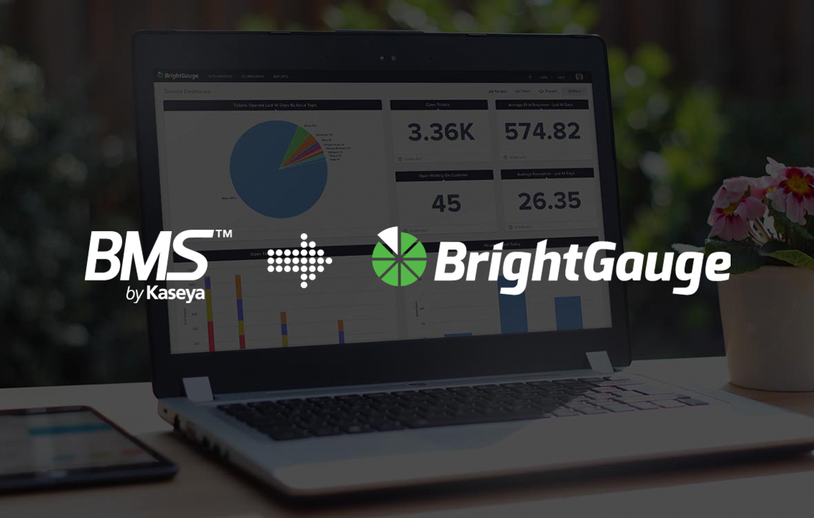
We’re excited to share our new integration with BMS by Kaseya, the cloud-based business management solution built specifically to help MSPs manage their business while spending less money on non-revenue-generating tasks! The anticipated BMS by Kaseya integration gives our partners a more complete view of the metrics that run their business, making it simple to monitor top-level KPIs or take a detailed look at service trends, alongside data from their RMM, financial applications, CSAT tools, and more. “Today’s MSPs are more serious than ever about using data to drive their business growth, and in order to do that they must be able to eliminate the data silo that exists between the tools in their technology stack,” said BrightGauge coFounder and CEO Brian Dosal. “With this integration, our customers will now have access to even greater insights within their BrightGauge which will empower them to make the best decisions for their business, based on the data at their fingertips.” “Business intelligence is a critical component that helps MSPs thrive in this competitive market. Our integration with BrightGauge further extends the BMS ecosystem, and provides our collective MSP partners with the data they need to drive better business results,” said Jim Lippie, GM for cloud computing, Kaseya. “BMS is the industry’s only purpose-built PSA for MSPs that delivers the exact tools and resources MSPs need to successfully run their business. The addition of BrightGauge to our partner portfolio is another example of Kaseya’s ongoing commitment to delivering the most functionally rich, innovative and effective solutions to our customers.” How To Make Data Driven Decisions with BMS by Kaseya + BrightGauge With BMS by Kaseya data in your BrightGauge, it’s effortless to monitor all of your most important metrics. That means everyone from your C-Suite to your front line can access the data they need to perform their best, every day. BMS by Kaseya Service Monitoring With a service monitoring dashboard, you’ll see ticket and technician statuses at a glance and be able to address issues as soon as they arise. BMS by Kaseya Executive Report Templates With a BMS by Kaseya report template, it’s no sweat to customize an automated report for each one of your clients. Simply set up the report once with the data they want to see, and schedule it for the time they want to see it. It’s an effortless way to keep your work at the top of their mind, and show them the value of the services you provide. Customized, Complex Gauge Building When your team is managing dozens or even hundreds of tickets each day across multiple networks, having the ability to monitor all ticket trends at once saves you the time and frustration of manually compiling the data. For example, with an Open Tickets by Assignee by Status gauge in place, you can easily see ticket trends among your Techs. You can clearly tell who may need additional training to reduce the number of ticket escalations, which Technician is being delayed by customers who haven’t responded to open tickets, or even ensure that your team is getting an even split of ticket types as compared to their peers. To learn more about BrightGauge and its suite of integrations, including BMS by Kaseya, please visit brightgauge.com/integrations. About Kaseya Kaseya is the leading provider of complete IT Management solutions for Managed Service Providers (MSPs) and midsized enterprises. Through its open platform and customer-centric approach, Kaseya delivers best in breed technologies that allow organizations to efficiently manage and secure IT. Offered both on-premise and in the cloud, Kaseya solutions empower businesses to command all of IT centrally, easily manage remote and distributed environments, and automate across IT management functions. Kaseya solutions manage over 10 million endpoints worldwide. Headquartered in Dublin, Ireland, Kaseya is privately held with a presence in over 20 countries. To learn more, visit www.kaseya.com.

Managed Service Providers have more data than just about any other business out there! So when it comes to tracking data points that will actually make a difference for your business, how do you know which metrics matter and which ones don’t? “What can we do to give the best client experience?” is the thought process for the Nucleus Networks team, as we learned from Karl Fulljames, VP of Operations. As Karl goes on to explain, from day one the Nucleus team has focused on client experience so that they could grow by word of mouth. By working backward from the end goal of an awesome customer experience, Karl explains how the Nucleus team has mastered client experience by staying focused on hiring decisions, service team processes, ticketing procedures, and more. Join us for the full conversation! Focusing on Client Experience in Managed Services: Episode Highlights Get to know Karl and Nucleus Networks (0:44) Dividing the team into pods and what that means for tracking service trends (5:33) Using a Coordinator (Dispatcher) to review and assign tickets and why Techs shouldn’t be put in this role (11:12) Nucleus’ 2-step close process (14:53) How did you choose the data points and parameters you track? (16:55) Why Client Experience has been a critical component at Nucleus from the beginning (19:39) What was the trigger point when you implemented a Coordinator? (22:39) Hiring green and promoting within vs. hiring at higher levels (25:39) What’s the typical customer for Nucleus Networks? (30:50) The Nucleus onboarding process for new teammates (35:13) Q&A: Favorite business book, parting advice for MSPs, how to get in touch with Karl (41:01) Books referenced in the episode: Anything on the PersonalMBA.com reading list 10 Days to Faster Reading, by Abby Marks-Beale Innovation and Entrepreneurship, by Peter Drucker Crucial Conversations: Tools for Talking When Stakes are High, by Kerry Patterson Ready, Fire, Aim: Zero to $100 Million in No Time Flat, by Michael Masterson Presentation Zen: Simple Ideas on Presentation Design and Delivery, by Garr Reynolds On Writing Well: The Classic Guide to Writing Nonfiction, by Made to Stick: Why Some Ideas Survive and Others Die, by Chip Heath and Dan Heath StrengthsFinder 2.0, by Tom Rath Want to find out more about The BrightGauge Podcast? Check out all the episodes here.