
If you’ve got direct reports, you likely have regular check-ins to discuss projects, strategies, and goals. It can be challenging to maximize time and productivity during these 1:1s and you might find that you’re spending too many hours each week prepping for these meetings or keeping them within a 30-minute or 1-hour constraint.
Data dashboards can help. This simple work hack can help you stay focused and get the most out of your scheduled time with each of your team members.
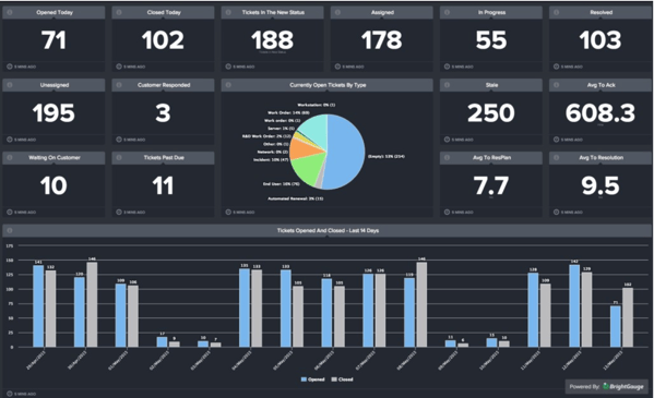
Creating customizable data dashboards through BrightGauge is really easy to do and the payoff is great.
Creating data dashboards in just a few steps
BrightGauge connects with plenty of popular business tools that you’re likely already using, like ConnectWise Manage and Automate, Webroot, IT Glue, Quickbooks, Salesforce, and more. Based on the data you’re monitoring through your PSA, RMM, or other tools, BrightGauge creates impactful data dashboards and client reports that provide insights needed to make smart business decisions.
We want every BrightGauge customer to start using their data as soon as they become a customer, so we’ve spoken to many business leaders like you to determine the common KPIs that matter most. Armed with that knowledge, we’ve pre-built default gauges, dashboards, and reports for each of the integrations we connect with. That means you can start using data dashboards on day one.
Of course, there’s always the option to create completely customizable dashboards, too. Here are the steps you need to take:
- On your BrightGauge homepage, select ‘New Dashboard’
- Name your dashboard and select the users you’d like to grant access to
- Start choosing gauges from your sidebar on the right side of your screen
- Add image or text modules for personalization and context
That’s all it takes!
If an existing gauge doesn’t contain the data you need, just create a new gauge by selecting the appropriate datasource and then build the gauge to your liking. You can add your new gauge to your desired dashboard once it’s complete.
If you’ve got any questions or need some help, you can always turn to our support team for guidance.
Turning data dashboards into 1:1 tools
At a recent Data-Driven Workshop, our customer, Natalie, told us she was having trouble managing eight 1:1 meetings per week that often ran over their 30-minute block. She leads a Support Team responsible for responding to tickets, entering billable hours, sending out customer surveys, and managing service level agreements (SLAs). When meeting with each of her direct reports, she wanted to review their performance and the feedback they get from clients.
Scrambling to find those numbers or generate reports for each team member was frankly taking too much time that Natalie can never get back. This got us to thinking about how exactly BrightGauge can drive productivity during 1:1 meetings.
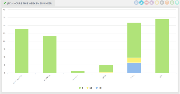
So what we recommend to all our business managers is to create a unique dashboard for each team member (i.e., Joe’s Dashboard, Jane’s Dashboard, etc.). Remember the pre-built default gauges we talked about? They’re going to help you out here.
With ConnectWise Manage, for example, two pre-built gauges are Hours This Week by Engineer and Open Tickets by Technician. This makes it easy to see exactly who is doing what.
Remember that you can also apply filters to your gauges, dashboards, and reports so you customize the data displayed to your specific needs.
Once you’ve created a data dashboard per each team member, you’ll have the metrics needed to hit the ground running with each 1:1 meeting. BrightGauge dashboards sync often so you’ll be looking at real-time data.
We like the idea of starting off each meeting by pulling up your direct report’s custom dashboard and talking through the data together. If there are any glaring issues, this gives an opportunity to have an honest and productive conversation about how to course correct.
Because you’re looking at factual data that’s being pulled in through various business tools, there’s no room for manipulation of information or skirting any issues. This creates a culture of accountability that is quite powerful.
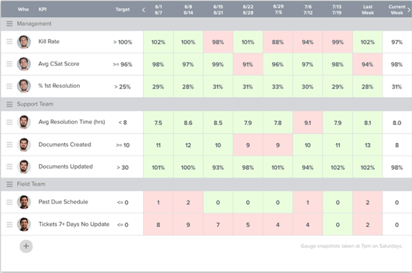
After reviewing the previous week’s or month’s data with your team member, it’s also a good idea to create short-term or long-term goals for upcoming months based on past performance. BrightGauge Goals can help you do that by allowing you to assign a goal to each team member and having them mark whether they are on or off track each week (designated by green or red tiles, respectively). This is another win for accountability.
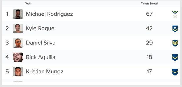
If you’re up for encouraging a little healthy competition, you can create leaderboards that track each of your team member’s performance against one another (like who answered the most tickets in one week). Include this leaderboard gauge in each of your individual data dashboards and use the numbers during your 1:1 to keep employees motivated.
With complete visibility into the metrics that matter for each of your direct reports, you’ll have the guidance you need to have really productive and efficient conversations with your team. The data will keep you focused on what matters so that you can avoid wasting time digging for information or having employees wonder how to get a conversation started.
Plus, because our custom dashboards are automated and pull in data in real-time, you’ll need to spend less time prepping for each meeting, which gives you the freedom to work on revenue-driving tasks and strategies.
Not yet a customer but want to see BrightGauge in action? No problem. Request a live one-on-one demo today!

Free MSA Template
Whether you’re planning your first managed services agreement, or you’re ready to overhaul your existing version, we've got you covered!