
Most of us would love to find more time in our workdays, but short of adding on more time at the end of the day, it’s pretty difficult to do so. When it comes to making sure we’re monitoring the important metrics and KPIs that leadership and clients care about, managing our teams to make sure we hit those marks, and reporting to everyone who needs the data, a good chunk of our workday is likely already gone. When you factor in emails, meetings, and casual conversations around the office, it’s easy to understand why many of us are clocking out later and later.
While we’ve all got to work with the 24 hours we have, there are ways to free up time to focus on revenue generating tasks. By automating parts of your business that already run like a well-oiled machine, you can buy some of your own time back and move forward with growth opportunities. This can help your business develop a valuable competitive advantage.
And, if you’re looking for a solution that helps you with all those tasks and can help you realize those goals, then let’s talk dashboards.
Quick Links
- What are dashboard reports?
- What is the purpose of dashboard reporting?
- Choosing the right KPIs for your dashboard
- 8 best practices for your dashboard management
- Dashboard reporting with BrightGauge
What are dashboard reports?
In short, dashboards provide data visualization. They present information regarding metrics or KPIs as gauges, graphs, or charts, so that those who need the information can take one quick glance at a single screen rather than creating spreadsheets based on data gathered from multiple sources. Because visual data is usually more quickly and easily interpreted, dashboards are an essential tool to monitoring and tracking data for your business.
Dashboard reporting enables you to gather essential data from those dashboards and forward reports on to the teams or individuals who need to be kept up-to-date. Further, with some tools, you can even automate those reports which become a valuable asset in customer/client communication and transparency, thereby strengthening those relationships.
What is the purpose of dashboard reporting?
Dashboard reporting allows you to track and take action on metrics and data that are imperative to your company’s bottom line and your customer’s success.
We’ve heard from MSPs who spend too much time each week compiling their data into meaningful reports —sometimes, upwards of 8-10 hours per week. That’s one entire workday of logging into multiple accounts, toggling between windows, pulling data into an Excel spreadsheet, and analyzing that data to find any compelling trends or indicators that drive your decisions. Sound familiar? We thought it might. The good news? There’s a different way to do things.
With dashboard reporting, the process of gathering data is automated, making it an easy and efficient way to buy back a big chunk of time.
Perhaps an even stronger argument for dashboard reporting is the effect it can have on internal and external relationships.
As briefly mentioned above, long-term, trustworthy relationships that result in employee loyalty and repeat business stem from being honest, unbiased, and transparent. Transparency means being open about the reality of your situation, whether it’s good or bad. When you act as an open book and report on actual data, you establish both credibility and reliability, especially when those reports are delivered consistently and on a regular schedule.
A dashboard report is also a professional and easily digestible way to show a clear snapshot of your business.
Let’s say your MSP is responsible for your client’s 25 endpoints. Every week, you may share with your client a dashboard report that shows the patch status of each endpoint, which machines are set to expire soon, and how many threats you mitigated in the previous week. This is an excellent way to prove your value as a partner while keeping your client looped in on their investments.
Further, it’s also a great way to allow your team to track the same metrics and goals. Then, when it comes time for employee and team evaluations, everyone’s on the same page regarding where improvements are possible.
Other dashboard reporting examples are:
- A sales dashboard showing your team’s active and won opportunities
- A support dashboard reporting on ticket statistics such as open tickets and time to resolution
- A customer satisfaction dashboard telling your clients how others are rating you
- A finance dashboard providing a quick look at the health and profitability of your company
- And so on.
Regardless of the metrics chosen for a dashboard report, its purpose will always lie in allowing you to focus on priorities while strengthening the basis of your client and team relationships. This means dashboard reporting can add value to any business—no matter your location, size, or industry.
What makes a good KPI dashboard?
Understanding why to use dashboard reporting is only the first step. Next, determining which KPIs are the right ones to make your dashboard a strong one. This will vary by department and by the overall goals of your company or your client, but there are some consistencies across the board.
For effective dashboard reporting, quality reigns over quantity. With a dashboard, you have one screen to paint your picture. Anyone looking at that screen should be able to quickly and easily digest the vital information. Overloading your dashboard with unnecessary gauges or graphs muddies the message and can lead to confusion about what’s really important.
You really want to prioritize the right KPIs for your dashboard report. More specifically, choose the ones that tell your data story in the most compelling way. What are the most meaningful KPIs to your bottom line? What would the person receiving the report want to see?
Business right now is data obsessed and, no doubt, data is key to so many business decisions and strategies. However, it’s easy to get attached to data and feel like it’s all important, especially when you’re trying to prove your value to your clients, but less is more! Focusing in on just a handful of essential KPIs will make your dashboard reporting more impactful.
KPIs should align with overall company goals and serve as a north star. Not only does reporting on those KPIs help guide a company towards success, but it gets everyone in the organization on the same page. Different teams have their own goals to work towards, but everyone’s ultimate mission is to see the organization succeed, and KPIs are a clear way to unify everybody.
Similarly, these reports can work to do the same thing for your clients. Simplifying their jobs and streamlining their ability to communicate to their leadership how your service is helping to achieve their goals can be incredibly valuable.
In general, all businesses are looking to evaluate performance in the areas of finance, customers, sales, marketing, operations, and within their own internal teams. Knowing this, your dashboard reports will likely have a healthy mix of KPIs from those business segments.
Here are some KPI examples to include in dashboards:
Finance
- Debt-to-Asset Ratio
- Return on Investment (ROI)
- Net Profit Margin
Customers
- Customer Satisfaction
- Net Promoter Score
Sales
- Monthly Recurring Revenue
- Age of Opportunity
- Quote to Close
Marketing
- Cost Per Lead
- Market Growth Rate
- Conversion Rate
Operations
- Effective Hourly Rate
- Service Level Agreements (SLAs)
- Time to Resolution
Internal Teams
- Revenue Per Employee
- Employee Churn Rate
- Employee Satisfaction
8 best practices for dashboard management
Regardless of the type of dashboard reports you’re producing, here are 8 best practices to ensure you’re staying organized, productive, and efficient:
- Make sure your data is relevant. Who is receiving your dashboard report or viewing your dashboard? Display only those metrics that make the most sense for those recipients. And, if you categorize your dashboards by recipient, team or topic, don’t include any metrics that may seem out of place or irrelevant.
- Use strategic metrics. Be strategic in what you choose (quality over quantity) and make sure the metrics you’re tracking align with your strategy for success. Look for and use compelling data that influences business decisions in a positive way. For clients of your MSP, you’ll likely want to report on service level agreement (SLA) KPIs. For your team, you’ll likely want to report on team or organizational goals. Set yourself and your customers up for success.
- Choose measurable metrics. Ever heard of SMART goals? SMART goals are Specific, Measurable, Attainable, Relevant, and Timely. By creating SMART goals, you can effectively measure your performance against benchmarks you’ve set so that you objectively know whether you’re on track. While it’s worth considering both qualitative and quantitative metrics, it’s more important to remember that if you can’t measure it, you can’t manage it.
- Keep your dashboards clean. Do yourself a favor and stay organized. Just like cluttered workspaces can be detrimental to your productivity, so can a cluttered dashboard. If looking at your dashboards causes you any sort of anxiety, your recipients are probably feeling the same. Choose the fewest metrics needed to completely tell your story and you should be in a good place.
- Track data you can take action on. Data is awesome and powerful, but it can only take you so far. What you choose to do with that data is what really matters. Focus on data that can influence your processes, hiring decisions, SLAs, annual goals, and so on. If you have a piece of data as an FYI, but can’t really act upon it, ask yourself if it’s worth tracking. The goal of businesses isn’t to just collect data, but to make data driven decisions.
- Take the ‘at-a-glance’ test. Once you’ve got your dashboard reporting template in place, take a quick glance and see what you’re able to glean from it in those couple minutes. Are you visually representing your data in a way that’s easy to digest? Are you using colors, bar graphs, gauges, and pie charts that get the message across pretty quickly and clearly? Avoid lots of text and numbers and use graphics when possible.
- Group your metrics into a nice grid. People like symmetry and organization and tend to gravitate towards clean lines that bring a sense of calm. Organize your dashboards as such. Different dashboard reporting tools allow you to modify and resize your buckets to your liking so that your dashboard is designed to your taste. Group relevant metrics together (like tickets closed beside tickets opened) so that your dashboard report is easy to read.
- Use dashboard filters. BrightGauge is a dashboard reporting tool that allows you to add dashboard filters to your reports. This can save you a ton of time. For example, a service desk manager who wants to send a report to each individual technician, specific to their projects, can create one dashboard reporting template and then create a dashboard filter that only returns data specific to that individual (so, Rick’s dashboard, Alex’s dashboard, Sam’s dashboard, etc.). In BrightGauge, you’d simply toggle on the dashboard filter for the individual you’re looking for and that’s it.
Dashboard Reporting with BrightGauge
There are different dashboard reporting tools out there that can help you create meaningful reports. Whichever you use, remember to employ these dashboard reporting best practices so you can make the most out of the data you’re tracking. While these tools can’t put hours on the clock, they can put hours back in your day.
Whether you’re looking at making remote work a regular option, have team members in multiple locations, or offer your MSP services to a wide variety of customers, dashboard reports can help your entire organization stay on top of teams and client-partner relationships.
To learn more about how BrightGauge can help you make faster, stronger, more informed decisions based on data, get in touch with us today. 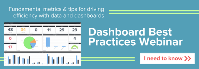

Free MSA Template
Whether you’re planning your first managed services agreement, or you’re ready to overhaul your existing version, we've got you covered!