Data is everything. It’s what you use to ensure that you’re on track to meeting your goals. It’s what you study to compare what works and what doesn’t. It’s what you analyze when deciding what to do next. This is not news.
However, every day, different software products pop up, promising to make your life at work run a lot smoother. Some do. Others are so confusing, it’s easier to just move forward without them.
But something you should be paying attention to are data dashboards. These nifty tools can significantly increase your business efficiency — without requiring that you become a tech expert to understand them. But, what exactly are they? What are their benefits? And how can they make your workflows more effective?
Quick Links
- What Are Data Dashboards?
- Why Use Data Dashboards?
- 10 Ways Data Dashboards Improve Efficiency
- Data Dashboards Best Practices
- BrightGauge's Dashboards Facilitate Data Visualization
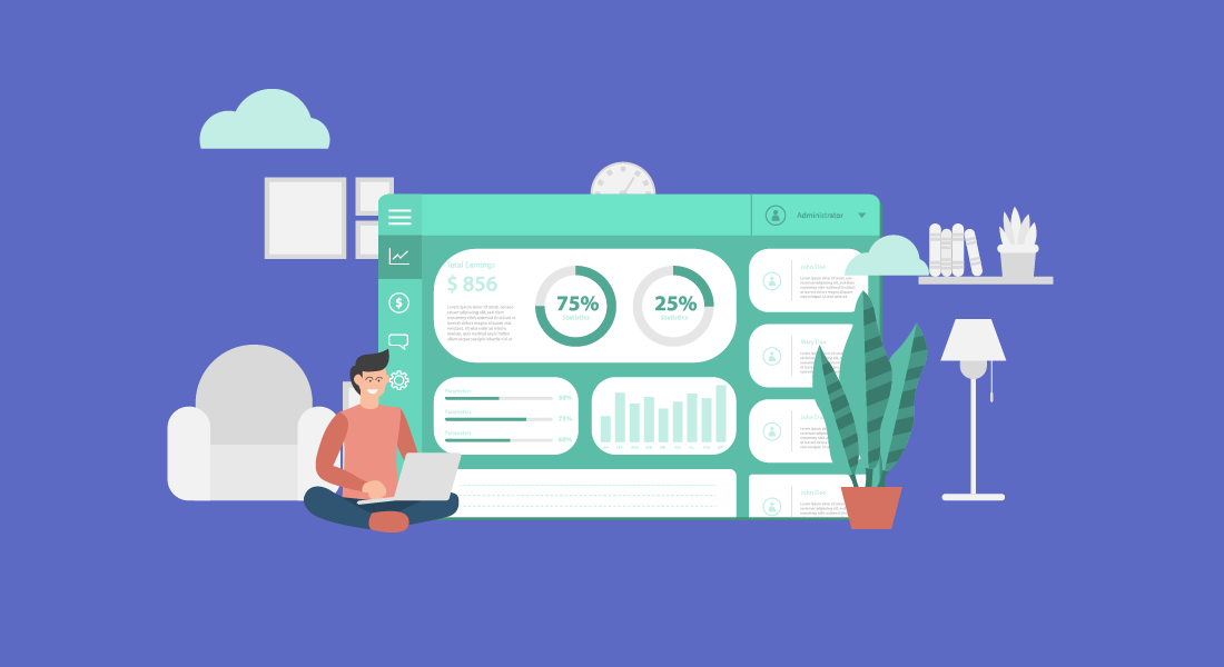
What Are Data Dashboards?
Data dashboards are snapshots displaying key performance indicators (KPIs). Your KPIs being gathered depend on your specific goals. For example, if you’re looking to increase website visitors, you may track not only the traffic to your website, but how long they spend on each page, how far down they scroll, and whether a particular page has a higher than usual bounce rate. By the same token, if you’re looking to improve your customer support department, you would track the number of issues logged in a day, average wait times, and resolution rates.
Specialized dashboards can be customized depending on a company's needs. Individual department dashboards, such as service operations, sales, security, network performance, and finance, are one way a company can track their corporate functions.
Why Use Data Dashboards?
Using data dashboards ensures that you are looking at all the relevant data you need, in one centralized location — in real time. You’ll want to use dashboards that you can customize to display data in a way that makes sense to you. Pie charts, line graphs, gauges, bar charts, etc. The key is in being able to access the information quickly and fully understand what’s going on at a glance.
Once you have this information right in front of you, you’ll be enabled to make data-driven decisions to improve processes and performance within your business.
Small to medium-sized business owners know what a big difference the smallest decision can make. The more knowledge you have, the more apt you are to make the right one. The more right decisions you make for your company, the higher its productivity.
10 Ways Data Dashboards Improve Efficiency
Ok. So data dashboards are essential to improve business efficiency. However, it’s good to be aware of the many ways in which it does so:
1. Create a Visual Presentation
Using visual aids such as graphs and charts, you are able to see all collected performance data in measurable amounts.
2. Centralize Your Data
You’ll no longer have to sort through information from separate files, or request personnel from different departments to help you prepare charts from multiple sources.
3. Achieve Transparency
When the data is right in front of you, it’s easier to communicate (and show!) to everyone involved what’s going on within a department. No guesses or euphemisms. You can’t hide from numbers.
4. Automate Reporting
You can save hours from your work day by using software that generates automated reports, instead of you having to manually create one.
5. Track Data in Real Time
Linking dashboards to your data sources allows for up-to-the-minute data review. This can be crucial in certain industries, such as healthcare and finance.
6. Identify Insights
You can’t improve what you can’t measure. If what you’re tracking seems to be going well, continue with the current processes. But if there is a decline (in productivity, quality, service), you’ll be able to see where the issues are coming from and make informed decisions on what to do next.
7. Improve Focus
Since you can set what it is you want to measure, you won’t be distracted by irrelevant data; nor will you waste time trying to theorize what’s causing roadblocks within your processes.
8. Drive Productivity
Your team will be better able to perform their job roles when they know exactly what’s working and what needs to be improved. Dashboards can also help you gauge capacity, so that you can determine whether there’s a need for additional training or new hires.
9. Improve Time Management
It’s quicker and more efficient to run one report rather than multiple reports. Information on dashboards is organized for an optimum overview.
10. Create a Data-Driven Culture
When you have clear data, you can make faster decisions. And because they’re based on accurate information, you’ll be eliminating instances of trial and error. This will enable you to significantly improve work for your team and experiences for your customers.
Data Dashboards Best Practices
Now that you’re aware of all the benefits of implementing the use of data dashboards in your business practices, it’s time to go over several best practices.
Select Relevant KPIs
Traditional KPIs include factors such as customer acquisition costs, revenue per client, customer lifetime value (CLV), and client retention, to name a few. You then take this data to make informed decisions regarding all of your business strategies.
However, limit the KPIs to choose exclusively to those who will help you move the needle forward on a particular task. If you’re looking to analyze client retention, you can include existing customer revenue growth, repeat purchase, and churn rates.
Be Consistent With Labeling
Keep language consistent across all of your business tools — customer relationship management software, files, and metrics. This will help avoid confusion and reduce the likelihood of misunderstandings or mistakes.
Choose a Layout That Makes Sense to the Reader
Remember how we mentioned above that you can design a dashboard’s layout? Fabulous. Now, keep in mind that for them to be beneficial, they should be displayed in the reader’s preference. Not necessarily you as the CEO (unless they’re being prepared for you), but for the team member who will then use the data to inform their decisions.
Nobody has time for boring or confusing reports. The reader should be able to understand what they’re looking at and what everything means with a simple explanation or review of the dashboard’s legend.
Use Responsive Dashboards
Data dashboards aren’t meant to just look pretty. Interactive elements (such as being able to filter, compare, and link data) make them a lot more useful. They also help you analyze data within context and see real-time updates.
Communicate Regularly
Every few months, re-evaluate if your current KPIs and layouts are aligned with your priorities. If there have been any changes in circumstances, communicate with your team about them and determine whether it’s time to update your dashboards accordingly.
BrightGauge’s Dashboards Facilitate Data Visualization
When it comes to choosing your business intelligence tools, you want to choose options that have all the functionality you need, out of the box, without complex coding involved. BrightGauge’s data dashboards integrate with over 40 platforms and are fully customizable to your business needs. You choose the metrics that matter. We help you monitor them.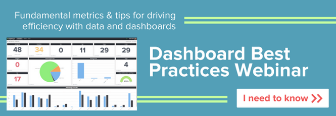

Free MSA Template
Whether you’re planning your first managed services agreement, or you’re ready to overhaul your existing version, we've got you covered!