Kite Technology Group (aka KiteTech) is a U.S. based Managed IT service provider offering consulting, infrastructure management, security and compliance, US-based help desk support, cloud solutions, ...
Kite Technology Group (aka KiteTech) is a U.S. based Managed IT service provider offering consulting, infrastructure management, security and compliance, US-based help desk support, cloud solutions, business continuity, and vCIO services. They package their suite of key IT services into a comprehensive support package specifically designed to proactively manage the unique technology needs of today’s organizations. Also, Kite Technology has earned the CompTIA Security Trustmark+™. This is the highest level of recognition for IT service providers that consistently follow security best practices, demonstrate a commitment to industry recognized security standards, and adhere to prescribed security compliance measures. Over the years, Kite Technology Group has become a trusted technology advisor to more than one hundred organizations across the United States. While Kite Technology Group specializes in serving independent insurance agencies, they also provide IT services to nonprofits, medical offices, legal firms, manufacturers, construction companies, and other professional organizations. A BrightGauge power user In 2021, we met with Daniel Gilbert, the Chief Operating Officer at Kite Technology Group, to spotlight their beautifully designed dashboards, reports, and goal lists. As a result, Daniel co-hosted a user showcase webinar and was featured in our Dashboard of the Month series. After such a pleasant working experience with Kite Technology Group, we wanted to learn more about them and their journey as a BrightGauge partner. So, we once again chatted with Daniel Gilbert to learn more about Kite Technology Group and to see how, over the last 6+ years, BrightGauge has become such a big part of their daily operations and success. Kite Technology Group's Dashboard rebuilt with dummy data. See a buildout key here. . How Kite Technology Group got its start Before forming Kite Technology Group, President Jeff Kite had already been self-employed for a decade. In 1992, Jeff was part owner of a cabling business when he realized he was much more interested in the computer side of IT than the cabling side. In contemplating his next move, Jeff knew he wanted the opportunity to combine his passion of helping people with his technical and networking skills. So, he decided to sell his share of that business and start an IT company. He was fortunate to have a jumpstart on that business because some of his cabling customers became his first IT customers. In 1994, Jeff got his first Insurance Agency customer and when he served them well, they invited him to speak at a local peer group for Insurance Agencies. This began what would eventually become the primary vertical for Kite Technology Group: Independent Insurance Agencies. Jeff operated for a long time but was struggling to mature and grow the business. By early 2004, Jeff started discussing the idea of a partnership with the now CEO, Greg DiDio. On January 1, 2005, Jeff and Greg established their partnership and rebranded the company as Kite Technology Group. After spending 17 years working for a Fortune 500 company, Greg left the comforts of “big business” to bring an “enterprise mentality” to KiteTech. With Greg on board, Jeff was able to focus on building relationships with customers, while Greg was able to build vision and process, allowing the business to steadily grow. During this time, Greg led the transformation of a former “break fix” company into the national full-service IT company that KiteTech is today. This positioned them to provide high-quality proactive services to even more clients. Further, it was by Greg’s wisdom that KiteTech began participating in HTG (now IT Nation Evolve) in February 2011. Having access to like-minded companies allowed KiteTech to learn from the successes and failures of others and to contribute to their peers’ successes as well. Over ten years later, Kite Technology Group is still an active IT Nation Evolve member. Another important turning point in the company happened in 2015 when Kite Technology Group established the Agency Executive Advisory Board. This was a group made up of principals at a handful of their customer locations, all running independent insurance agencies. The goal was to get a group of like-minded business leaders together (like Evolve) and learn what KiteTech could do to transform their company and better serve their needs. Daniel said “going into this process, we thought we would learn about the other aspects of IT we should be offering our clients. Instead, we learned that what our customers wanted most was advisement on how to run their insurance agency business better. We decided that we had an opportunity to build a consulting practice designed to help agency owners and their leaders improve their business operations. In 2016, we hired our first agency consultant, and have continued to deliver and grow ever since.” Between 2005 when Kite Technology Group was officially founded and today, they have grown from about 5 employees to about 40 employees servicing over 100 fully managed IT clients. Becoming a BrightGauge partner Prior to BrightGauge, Daniel said Kite Technology Group used ConnectSmart for several years. However, they found it cumbersome, requiring a heavy application for dashboard design and a dedicated machine for displaying data. That drove them to look for easier-to-use alternatives. After discovering BrightGauge in 2016, Daniel said he immediately realized how intuitive the standard web UI was right out of the box. Daniel stated “it was simple to add the datasources they needed including LabTech (now Automate), QuickBooks, Quosal (now Sell), and ConnectWise Manage. And having all of our data in one product that was easy to adopt was a game changer!” As Kite Technology Group added additional tools, such as SmileBack, and processes like EOS, they were able to continue building out and fine tuning their dashboards, reports, and goal lists through BrightGauge. What BrightGauge has helped Kite Technology Group accomplish Daniel said BrightGauge has been the cornerstone of KiteTech’s business intelligence ever since they first adopted it in 2016. In the beginning, they were only using BrightGauge dashboards to help their teams keep a handle on service metrics, such as number of open tickets, unassigned tickets, and aging tickets. These kinds of metrics are particularly helpful to the dispatchers and arm them with the data they need to assigned or reassigned tickets efficiently. The dashboards also helped KiteTech’s engineers stay on top of tasks, time entries, and helped them to better prioritize their tickets. By utilizing dashboards, team leads also knew where their support was needed and that enabled them to proactively prevent tickets from aging unnecessarily. As a result, Kite Technology Group has been able to drastically improve their SLA adherence metrics. Daniel said once they saw the success they were having in the service team, they started to spread their BrightGauge footprint into other areas of the business like NOC, Sales, Marketing, and Finance. Eventually they started making use of Goal Lists for their weekly EOS check ins, which has been instrumental in helping them achieve their company objectives. Kite Technology Group now uses Goal Lists at all levels of the organization for their EOS scorecards and Rocks. Today, every department of the company has dashboards and goal lists to look at, and every single individual in the company has multiple goals for which they are responsible. This added level of transparency and accountability has propelled Kite Technology Group's growth and has helped them garner happy customers. In fact, Kite Technology Group's 5 star google rating illuminates just how happy their customers are! Connected Datasources: ConnectWise Manage, ConnectWise Automate, SmileBack, QuickBooks, and OneDrive Top 5 KPIs: Billable Utilization Team-Wide Billable Hours Scheduled Tickets/Hours Billable Labor Revenue Revenue from Opportunities (Won and Expected)

For most Managed Service Providers, sales is the cornerstone of growth. As such, developing a solid sales pipeline for stable recurring profit is paramount. As part of a proactive process for a well-managed sales pipeline, you need good data entry practices and good data visibility. This is where dashboards come in! Creating a sales pipeline dashboard can help you analyze lead quality, sales success rates, and enable you to provide valuable data for reviewing and improving your process. For the May Dashboard of the month, we have featured a Company Sales Pipeline dashboard inspired by May's user showcase webinar, Powerful Dashboards to Grow your Sales Pipeline with D.J. Hanen, the senior director at Five Star Technology Solutions. The Company Sales pipeline dashboard is designed for the sales manager and should be checked weekly or biweekly and used in team meetings. This dashboard can also be cloned and filtered for individual sales representatives so each sales rep can better manage their own pipeline. Company Pipeline - view here. Here are some featured metrics: Deals in the Pipeline - This snapshot gauge can track trends related to how many leads your team is bringing in over time. Sales Funnel - This gauge tracks leads as they move through the customer journey. It usually covers several sales stages that equate to your prospects' awareness, interest, decision-making, and action stages. A healthy pipeline resembles a funnel where a larger amount of qualified leads are at the top portion of that funnel. Past Due and Missing Revenue - This set of gauges is all about keeping good data by managing past due activities and opportunities, and making sure opportunities past the lead stage have an estimated revenue set. Won vs Lost Opportunities - Tracking what percentage of your leads are lost can help you fine tune your lead generation process, better determine your ideal client profile, and help you implement different sales techniques where needed. Company Pipeline Gauges - Across several gauges looking at different time frames, these metrics look at the sales funnel in a more granular way. They include the number of opportunities, the amount of revenue, and the margin in each sales stage. Thank you, D.J., for collaborating with us and sharing insights on your sales process and how you've managed to improve that process to get better sales data overall. Recreate in your BrightGauge Company Sales Pipeline Dashboard (public view link) Company Sales Pipeline Dashboard Buildout Key Make sure to visit our library of more report and dashboard templates and please feel free to reach out to success@brightgauge.com with any questions!
The client onboarding process is an opportunity for you to instill trust and confidence in your services to your new clients. Even though a successful onboarding can lay the groundwork for a positive, long-term relationship, many MSPs find themselves struggling with unforeseen mishaps and miscommunications. With such a high stakes moment in your client relationship, you'll want to ensure your business shines by setting up a system that predicts and avoids major pitfalls altogether! One of the best things an MSP can do to set themselves up for success during this critical time is to check, double check, and audit their work. For the April Report of the month, we have featured an onboarding audit report inspired by April's user showcase webinar, Motivating your Teams to Meet Company Objectives with Anne Schoolcraft, President at a Couple of Gurus and a professional EOS implementer. A Couple of Gurus is an award-winning IT services company that helps world-changing organizations with Managed IT services, managed cybersecurity, cloud solutions, IT consulting, and more. And as a professional EOS implementer, Anne helps entrepreneurs get more of what they want from their businesses, by helping them implement a system of simple, practical tools. The onboarding audit report was designed to be run at the tail end of the onboarding period and works as a proactive assessment so your team can double check their work before they've completed the onboarding process. This will help you identify potential problem areas like critical items that your team may have missed and items your customers should address before onboarding is completed. Onboarding Audit - view here. Here are some featured metrics: All Managed Machines - By seeing how many machines are being reported on in your RMM tool, you can cross check what you quoted the client and ensure they are set up to be billed properly. You can also make sure all devices are reported on as configurations in your PSA. Anti Virus protection audit - Allows you to check whether antivirus was successfully enabled on all devices. Configuration Expiration details - Use these metrics to ensure you have the warranty expiration dates for all devices. Next, review the warranties that are expired or are about to expire. These should be prioritized and you can set that discussion to take place before the onboarding process is over. After Hours Access and Software criticality Configuration Q&A - You can set up custom configurations in ConnectWise Manage to ask your clients questions on how you should handle emergency situations and after hour access to their offices. You can also use configurations to help identify the most business critical software for each of your clients. NOC and Security Tickets - Make sure alert tickets are properly configured and reporting to the right board in your PSA. Thank you, Anne, for collaborating with us and sharing your invaluable insight on setting up a simple and practical report to audit the onboarding process! Recreate in your BrightGauge Onboarding Audit Report (public view link) Onboarding Audit Report Buildout Key Make sure to visit our library of more report and dashboard templates and please feel free to reach out to success@brightgauge.com with any questions!
A dispatchers job is to maximize the utilization of the service team. In essence, they need to keep resources busy and ensure every ticket that comes in gets scheduled out and attended to properly. When you're juggling all the nuanced differences across teams and agreements while also making sure to check every field entry for accuracy, things can inevitable fall through the cracks. Having a ticket dispatch dashboard in BrightGauge can help your dispatcher easily pick up the missing pieces and "paint tomorrow green." By using a simplistic design and simplifying your service KPIs, you'll help your dispatcher works as efficiently as possible. For the March Dashboard of the month, we have featured a ticket dispatch board inspired by March's user showcase webinar, Simplifying Service KPIs to Support Rapid Growth with Ken Smith, Chief Operating Officer at 2W Technologies. Ticket Dispatch - view here. The ticket dispatch dashboard is broken out into 3 parts. The first section takes a manage to zero or manage to green approach focusing on priority tickets and important ticket fields that can get overlooked like type, agreement, and configuration. The second section focuses on process and scheduling. A text box is used to provide the steps to take for triaging, dispatching, and escalating tickets. Next, information on upcoming schedules, current ticket assignments, hours worked, and information on whose out of the office proves the perfect supplement for ConnectWise Manage's dispatch portal. The last section provides some high-level metrics to help further understand ticket volumes and gauge the utilization of the team. It includes metrics like same-day resolution percentage, average time to resolution, and tickets per endpoint. Thank you, Ken, for collaborating with us and sharing your straightforward technique to building dashboards to improve operational efficiencies! Recreate in your BrightGauge Ticket Dispatch Dashboard (public view link) Ticket Dispatch Dashboard Buildout Key Make sure to visit our library of more report and dashboard templates and please feel free to reach out to success@brightgauge.com with any questions!

Many Managed Service Providers (MSPs) offer a variety of services across a wide range of small business clients. This can make for a tricky billing process! One of the biggest pain points with creating a streamlined billing process is figuring out how to efficiently track and review time entries. Although most PSAs provide a built-in time-tracking system for technicians, human and technical errors are inevitable when your billing is complex. To help keep track of important details without having to sift through 100's of time entry records each week, you can create a dashboard to flag potential problems in real time. For the February Dashboard of the month, we have featured a less customized version of the invoice time review dashboard shared during this month's user showcase webinar, Customizing your Data for Improved Service Delivery with Todd Moss, partner and managing director at 24HourTek. The Invoice Time Review dashboard used at 24HourTek contains both metrics and information that assists them with the invoice time review process. Using a heavy amount of text, 24HourTek outlines the various time entry guidelines for all of their different business offerings and creates metrics to look for red flags in their data. Checking this at least weekly has helped to eliminate costly delays and alleviate major headaches for the billing team. While the dashboard of the month version omits the text boxes, you can get a sense of what they are tracking below. Invoice Time Review - view here. Here are some featured metrics: Time review based on agreement types - Across several gauges, you can look at your time entries in a more meaningful way. On this dashboard, the partner is looking at break-fix, fully managed, and block time clients separately. If you have special rules or specific coverages for each, you can use text boxes to document that. This can aid the review process. Member Time Review - Reviewing technicians' time is equally as important as reviewing time during the billing process. Here, the partner is looking at billable utilization, time spent on various work types, late time sheets, and they have created a custom gauge to help determine whether technicians are entering time on time, all the time. Work Type and After Hour reviews - These gauges look for work types that require special care like after hours and non-covered. You can choose to break down all time entries by their work types as well. Further, by looking at time entered after hours, you can look for improperly entered time and ensure work types are set correctly for after hour billing. Thank you, Todd, for collaborating with us and sharing these great metrics! Recreate in your BrightGauge Invoice Time Review Dashboard (public view link) Invoice Time Review Dashboard Buildout Key Make sure to visit our library of more report and dashboard templates and please feel free to reach out to success@brightgauge.com with any questions!

70+ Metrics for MSPs
Key metrics and accompanying formulas to help MSPs skyrocket growth and success!
Get your KPIs
Account managers have two main goals: retain clients and grow those opportunities. To assist in meeting those goals, you'll want to know what's going on with every aspect of the clients' experience. From tickets, invoices, and contracts, to proactively pinpointing potential problems, having a dashboard with real-time date is an ideal tool that can provide your team with those accurate up-to-the-minute insights. For the January Dashboard of the month, we have featured the client overview metrics for account managers shared during last month's user showcase webinar, Critical KPIs Owners Track for Client Management with James Cash, the owner and managing director at SuperFast IT. Superfast IT provides IT support in Birmingham, England with their managed IT and cybersecurity service packages. In addition, Superfast IT helps small businesses pass Cyber Essentials accreditation. Their service offerings help business owners focus on their business instead of getting bogged down by day-to-day IT and security issues. Over the years, Superfast IT has become synonymous with industry-leading customer service and fast response times, backed by their many five-star Google review ratings. The Client Management Overview dashboard used at SuperFast IT contains metrics that enables account managers to provide top notch support by arming them with the real time data they need for successful conversations. Client Management Overview Dashboard - view here. Here are some featured metrics: Cross-Sell Opportunities - Using recently invoiced agreement additions, you can determine what service offerings each of your clients are currently paying for. Then, using a simple icon for 'there is a cross-sell opportunity,' your account managers can act proactively to grow business. Agreement Information - This gauge includes some of the key metrics needed to understand client profitability including hours per user, hours per endpoint, recurring margin, and effective rate. Open tickets, tickets with 1+ hour, and recent activity - When checked frequently, account owners can gauge how many currently open or recently opened tickets are too many. This allows them to look into that recent activity quickly and escalate where needed. Thank you, James, for collaborating with us and sharing these great metrics! Recreate in your BrightGauge Client Management Overview Dashboard (public view link) Client Management Overview Dashboard Buildout Key Make sure to visit our library of more report and dashboard templates and please feel free to reach out to success@brightgauge.com with any questions!

When it comes to keeping your executive team in the loop on important performance metrics, providing an easy-to-digest view into client profitability is crucial. For the December Dashboard of the month we have featured Client profitability metrics shared during this month's user showcase webinar with Paul Recksiek, the CTO at Solvere One on Simple & Effective Tools for Improving Company Performance. Built for the executive leadership team, this dashboard starts off with some high-level metrics like active and supported contacts, MRR, Hours by work type, and Net Profit. Then, the second half of the dashboard allows for a granular, client by client view into profitability. On one dashboard, it's easy to understand if you're hitting your MRR and Net Profit goals for the year, which customers are worth nurturing further, and where there are opportunities for training, automation or hardware refreshes with clients not meeting the profitability mark. Client Profitability Dashboard - view here. Here are some featured metrics: Seat Prices - If you're using a per-user pricing structure, it's important to keep an eye on each month's fluctuation in users to make sure it aligns with your all-in-seat-price model. This gauge allows you to quickly spot whether or not an agreement needs to be adjusted based on an influx of supported users. MRR Per Hour, otherwise known as the Effective Hourly rate on agreements - MRR per hour compares what you've billed for your agreements against the amount of hours worked for each client. This gauge will quickly show you if you're spending too much time with any one client. Profitability Of Agreements - This gauge illustrates how profitable your agreements are after the fully burden cost of your techs is taken into consideration. The cost for the techs fluctuates based on the amount of work you've done for each client. Thank you, Paul, for collaborating with us and sharing these great metrics! Recreate in your BrightGauge Client Profitability Dashboard (public view link) Client Profitability Dashboard Buildout Key Make sure to visit our library of more report and dashboard templates and please feel free to reach out to success@brightgauge.com with any questions!

With setting a standard for team performance meets client satisfaction, SLAs (Service Level Agreements) are the best first stop. For this month's dashboard of the month, we focused on highlighting this great action-forward help desk dashboard featured during November's User Showcase webinar with Daniel Gilbert, the COO at Kite Technology Group: Future-Proofing your Team with Goal Setting. The Help Desk SLA Scorecard is all about SLA's and giving the Help Desk team a tool to properly manage them. Kite Technology uses this dashboard to help the team prioritize tickets based on SLA's. Also, Kite Technologies ties this dashboard back to their executive leadership goals, allowing them to drive accountability and properly measure their success as an organization The Help Desk SLA Scorecard dashboard uses a simple and straight-forward design that is easy for the team to read and follow. They use color thresholds and a "manage to green" approach to help the team prioritize, and each section of the dashboard represents the different SLA stages. Help Desk SLA Scorecard dashboard - view here Dashboard details: In play - The ticket is pending the coinciding SLA action and needs to be acted upon today in order to hit their goals. Missed - The ticket did not hit their SLA goal and are still pending the coinciding action item. In the Goal - This provides some insight on how well they're doing overall with their SLA goals for the day. This section includes how many tickets and what percentage of tickets hit their SLA targets and what their averages are. Thank you, Daniel, for being our partner and collaborating with us! Recreate in your BrightGauge View the dashboard example here. Review how to recreate in your BrightGauge with this buildout key. Make sure to visit our library of more report and dashboard templates and please feel free to reach out to success@brightgauge.com with any questions!

Running a business in the digital age requires using a wide array of technologies — hardware, software, cloud infrastructure, and cybersecurity, to name a few. And, because nothing really works in silos, it’s vital for each of these components to work seamlessly together. This is crucial to maximize efficiency and reduce the risk of errors. Thankfully, software integrations make this a reality. But what, exactly, are they? In what ways can they affect your business? And how do you know which type would work best for you? Quick Links What Are Software Integrations? 5 Reasons Why Software Integrations Are a Must Types of Software Integrations How Integrations Affect Business Operations Custom vs Out-of-the-Box Integrations The Software Integration Process How Do BrightGauge Integrations Work? What Are Software Integrations? Software integration means syncing different types of software so that your entire team can do their jobs effectively. It’s what allows you to pull all data together instead of having each piece of information isolated from each other. Imagine if your email weren’t connected to your calendar or project management system. Or if your cloud infrastructure couldn’t be enabled to be accessed by people outside of your organization — such as business partners and clients. While it seems like common sense, it’s actually a common challenge many businesses face; especially as they grow and their number of applications keep expanding: customer relationship management (CRM), content management system (CMS), inventory management software, etc. Fortunately, software companies are being proactive about solving this issue. And businesses who aren’t staying on top of this trend will undoubtedly see unfavorable consequences. 5 Reasons Why Software Integrations Are a Must Software integration should always be non-negotiable. When your tools are able to work together, your entire team — and your bottom line — reaps the benefits: 1. Improved Efficiency Think about all the job roles that overlap: sales and marketing, legal and compliance, finance and payroll. If everyone had to enter information manually and relay this data to other departments via other forms of communications, your operations would slow down significantly. Time would be wasted. Items would fall through the cracks. Fortunately, when you're integrating systems, your business data is shared across all your tools. 2. Improved Cost Effectiveness Having to find and export information can be time consuming — time that could be better used running the business, nurturing your leads, and closing sales. Time is money, and software integrations save you a lot of both. 3. Increased Productivity When all applications are communicating with each other, you remove delays caused by having to manually share information among departments. This type of information flow allows all members of your company to access files and know the status of projects within seconds. 4. Reduced Risk of Error Not having to rely on humans to input information sourced from elsewhere means a lower likelihood of mistakes, incomplete information, or duplicate work. This ensures reliability and better performance. 5. Better Customer Service Integrations improve customer service in a couple of ways: When a client calls, no matter to whom they’re speaking with, your team member will have all relevant information — regardless of whether it relates to sales, marketing, or support. Types of Software Integrations There are several types of software integrations. Which one would be the most ideal for your business depends on your circumstances — such as the size of your team, your number of applications, and the need for each department to collaborate. Specifically, you can look for any of the following: Star Integration Star integrations (also known as spaghetti integrations) refers to inter-departmental interconnection of all their applications. This method provides high functionality, but the higher the number of connected apps, the more complex it can become to manage it. Horizontal Integration Horizontal integration refers to having one main, central system that links to all other applications — yet the rest of the applications aren’t connected to each other. The central system is known as an enterprise service bus (ESB). Vertical Integration Vertical integration links applications based on how closely related they are within their job functions. This can be an efficient way to avoid confusion and unnecessary connections. However, each interconnected section works in silos; so you may still need to exchange communications manually should the need arise. Common Data Format If all your systems require different semantics to understand data, you would need an adapter to convert it every time it communicates with another application. This can be solved with common data format integration, which consolidates data from several sources and keeps it all stored in a single location. How Integrations Affect Business Operations If you’re old school, you may be tempted to think that if things have been working out fine with integrations, why change it? However, no person is an island. Your competitors are implementing them; and you don’t want to be the slowest business in the industry based on something as preventable as relying on outdated technology. Software integrations provide you with the right information exactly when you need it — so you can make data-driven decisions as fast as possible. In addition, software integrations enable you to run your business with a smaller team. By all means, hire as you scale; just not because your team feels short-staffed and overextended by the time and effort it takes to enter data manually across applications. Custom vs. Out-of-the-Box Integrations Ok. So you know you need software integrations to optimize your business operations. It also behooves you to be aware that there are two ways to purchase them: Custom Integrations Custom software integrations are specifically catered to your business needs. They are flexible, can integrate with all the other applications you use, and they can give you a competitive edge over other businesses who are still using standard software. Do keep in mind that they have a steeper learning curve and require a higher budget. That said, they are beneficial on a long-term basis, as they can be scaled and adjusted as your business grows. Out-of-the-Box Integrations Out-of-the-box software integrations are relatively easy to learn how to use, and are ideal for businesses with standard operations (CRM, marketing, sales, support). There’s minimal effort to set it up and there’s no technical experience required; so you can start using it soon after purchase. Some of them also allow for minor customization. The Software Integration Process If you’re ready to get the ball rolling on integrations, first develop a roadmap that can help you determine what you need. Follow along with these tips: Identify Your Business Needs Make a list of all the solutions you are currently seeking. Get feedback from your team — especially those right on the front lines — about which types of processes would enable them to do their jobs more efficiently. Analyze Feasibility Does what you need exist? If not, can it be designed? Can you compromise on anything? Will you need additional features in the near future? You need to take into account all of these questions to make a cost-effective decision. Otherwise you could end up making a purchase now, only to find out later that you’ll need to make another one a handful of months or years down the road. Design the Infrastructure Which apps need to be connected with which other ones? Which departments need to work together or have overlapping elements? This will help you determine whether you need a vertical, horizontal, or star integration, and optimize workflows. Leverage Testing If you opt for a customized solution, it needs to be tailored to your needs, and you should perform quality assurance. And even with a straight out-of-the-box solution, it needs to be tested once integrated with all of your required software and ensure all relevant data transfers are performed successfully. Provide Maintenance Once installed, remember to perform routine maintenance checks to detect and patch any bugs and/or install necessary upgrades. It is also during this stage that you can decide whether it’s time to install additional features as your business needs evolve. How Do BrightGauge Integrations Work? At BrightGauge, one of our northern stars is to provide excellent customer service. We understand that’s the backbone of any company — ours and yours. It’s because of this reason that all our products (dashboards, goal management, and client reporting) integrate with many of the tools you're already using. We also regularly listen to our customers’ wants and needs — providing solutions that address your specific challenges means giving you back hours of your time. Our integrations process goes through several steps: Look into the existing support for software to integrate. Determine which key performance indicators the software will allow our tools to track. See if the tools are hosted or cloud-based. Understand complexity of connecting into their API. Determine if their database supports third-party queries. We also take a good look into whether the trackable KPIs are relevant to your needs. This is because we always strive to provide you with useful data that can help you make better informed decisions. Choosing the Right Integration Tools Integrating software doesn’t have to be as time consuming as it sounds. With the right tools, like BrightGauge, you can have your business operations running as smoothly as possible. If you are looking to customize some of your own integrations, speaking with a product engineer is a great place to start. Some of our partners have reported that our tools have saved them 8 - 10 hours per week, which is time they can now spend focusing on revenue-generating tasks — or on doing some fun stuff with their loved ones after a long day at work. For an in-depth look at the BrightGauge integrations and other features, please contact us so we can set you up with a live demo.
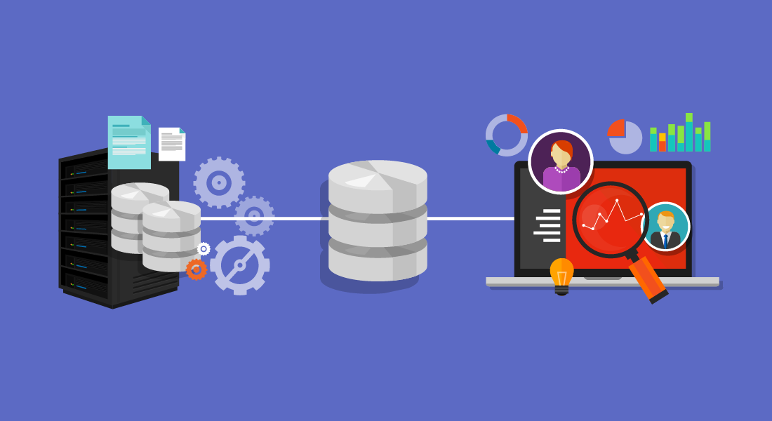
Modern life runs on data. Even if you don’t track anything in your personal life, search engines and social media do it for you. You understand it’s by design, to show you content you would be interested in, or to try to persuade you that yes, you indeed need yet another pair of running shoes. And when it comes to your professional life, you’re aware that collecting business intelligence is the only sound way of tracking progress and making decisions. The reasons can be endless — getting an overview of website visitors, conversion rates, or customer support tickets, to name a few. But what’s the most efficient way of doing so? With so many options available, it can be overwhelming to look into what would be the ideal solution for your needs. Enter data warehousing and snapshots. Up until this point, you may not have been aware of how much you need them. But need them, you do. Quick Links What is Data Warehousing? How a Data Warehouse Works 5 Benefits of BrightGauge Snapshots, a Data Warehousing Solution How To Set Up Snapshot Gauges BrightGauge Provides Effective Data Warehousing With Snapshots What is Data Warehousing? Data warehousing refers to the electronic storage of business information. It facilitates data management by allowing users to organize, categorize, and analyze large amounts of data. They are different from traditional databases because data warehouses are specifically designed to perform analytics from large quantities of information. Data warehouses can extract information from a wide array of sources, including: Relational databases Data software Business applications Processing systems Marketing and sales departments Finance And many more They are beneficial because they collect information consistently, make it easily accessible, allow collaboration, and enable data-driven decision making. And just like servers, infrastructure is available to keep on-site or cloud-based. Another benefit is that you can compare up-to-date data with historical information so that you can have reference points, track progress, and identify trends. How a Data Warehouse Works Data warehouses source information at regular intervals — or cadence. You can then create dashboards so that you can identify insights from the collected information. This process involves three layers of data: The first layer contains the extracted information. The second layer transforms/formats the information. The third layer organizes it and displays it on dashboards. This process is known as ETL (for extract, transform, and load); and it’s an invaluable tool to analyze business intelligence, since not only does it integrate information from multiple sources, it also provides an in-depth historical context. 5 Benefits of BrightGauge Snapshots, a Data Warehousing Solution At BrightGauge, we offer data warehousing, as well as an upgraded version for our customers on our enterprise plan, Enterprise Data Warehouse (EDW). This upgraded version includes a Snapshots feature, which captures even more in-depth, complex data and performs calculations. There are several clear advantages to using our Snapshots solution: 1. Use Automatic Compilation of Metrics Data can come from so many different sources, in so many different formats. And while there are many tools that help businesses compile data, our Snapshots feature does so automatically and displays it all in one custom-made chart. 2. Track End-of-Day Tickets Customer service is the backbone of any business — and it’s something every company should consistently work on improving. Since Snapshots collect data automatically, you’ll be able to easily identify whether your support services are efficient or whether you have an expanding backlog of tickets. 3. Keep Track of Pipeline Health By the same token, Snapshots can provide you a detailed view of your sales pipeline, as well as whether you’re on track to meeting your sales goals. And it’s not just a matter of how many sales qualified leads are present at any given moment. You also want to be able to track performance at each stage of the buyer’s journey, as well as the costs associated with getting people to the bottom of that funnel. 4. See Your Sales Cycle Timeline How long does it take you to close a sale? How much time do you have to spend nurturing leads before they become so enamored with your services, they choose you over your competitors? It can take months for B2B marketing to work its magic — maybe a slightly shorter timeframe for SaaS businesses. But you want to keep track of the entire process to see whether you can identify any areas for improvement. 5. Remote Monitoring and Management Tracking If you're managing your company's network through an RMM tool — such as ConnectWise Automate — Snapshots can gather information regarding space usage, server patch status, operating systems, or anything regarding your infrastructure, so that you can identify trending endpoints. How To Set Up Snapshot Gauges The Snapshots feature is only available on the Enterprise Plan; and you can turn any gauge in your account into a snapshot. Find a metric that you want to track. Select the timeframe you want to take the snapshots — daily, weekly, or monthly. You can do this by clicking on Design on the top left navigation bar, then scrolling down to the Schedule green button on the left side of the screen. If you choose weekly or monthly, you can choose on the dropdown menus which day of the week or month you want to take the snapshots. Select the number of data points you want to include on the graph from the drop down menu that’s located under the scheduled dates and times. Remove the dimensions on the gauges by clicking on Dimensions on the navigation bar at the top of the screen. Select the gauge you’re tracking from the icons at the top of the page. Select the camera icon at the top of the page. The most recent data will always appear on the top right corner of the snapshot. As you continue selecting the camera icon for the different gauges you want to track, you’ll see each section appearing in the middle of the snapshot’s graph. If you need visual instructions for how to do this step-by-step, you can watch the video tutorial on our website. BrightGauge Provides Effective Data Warehousing with Snapshots If you are toggling between many tools, pulling data from each of them, inputting it into an Excel spreadsheet, and then spending hours analyzing it to draw conclusions, you could be eating into many valuable hours of your time. BrightGauge gives you back that time. Some of our partners have said that our tools have saved them eight to 10 hours per week, which is time they can now spend focusing on revenue-generating tasks. For an in-depth look at the BrightGauge Snapshots and other features, please contact us so we can set you up with a live demo.
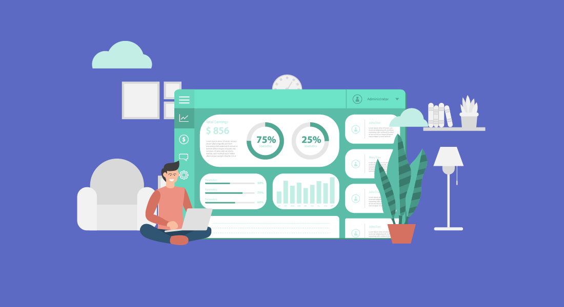
Data is everything. It’s what you use to ensure that you’re on track to meeting your goals. It’s what you study to compare what works and what doesn’t. It’s what you analyze when deciding what to do next. This is not news. However, every day, different software products pop up, promising to make your life at work run a lot smoother. Some do. Others are so confusing, it’s easier to just move forward without them. But something you should be paying attention to are data dashboards. These nifty tools can significantly increase your business efficiency — without requiring that you become a tech expert to understand them. But, what exactly are they? What are their benefits? And how can they make your workflows more effective? Quick Links What Are Data Dashboards? Why Use Data Dashboards? 10 Ways Data Dashboards Improve Efficiency Data Dashboards Best Practices BrightGauge's Dashboards Facilitate Data Visualization What Are Data Dashboards? Data dashboards are snapshots displaying key performance indicators (KPIs). Your KPIs being gathered depend on your specific goals. For example, if you’re looking to increase website visitors, you may track not only the traffic to your website, but how long they spend on each page, how far down they scroll, and whether a particular page has a higher than usual bounce rate. By the same token, if you’re looking to improve your customer support department, you would track the number of issues logged in a day, average wait times, and resolution rates. Specialized dashboards can be customized depending on a company's needs. Individual department dashboards, such as service operations, sales, security, network performance, and finance, are one way a company can track their corporate functions. Why Use Data Dashboards? Using data dashboards ensures that you are looking at all the relevant data you need, in one centralized location — in real time. You’ll want to use dashboards that you can customize to display data in a way that makes sense to you. Pie charts, line graphs, gauges, bar charts, etc. The key is in being able to access the information quickly and fully understand what’s going on at a glance. Once you have this information right in front of you, you’ll be enabled to make data-driven decisions to improve processes and performance within your business. Small to medium-sized business owners know what a big difference the smallest decision can make. The more knowledge you have, the more apt you are to make the right one. The more right decisions you make for your company, the higher its productivity. 10 Ways Data Dashboards Improve Efficiency Ok. So data dashboards are essential to improve business efficiency. However, it’s good to be aware of the many ways in which it does so: 1. Create a Visual Presentation Using visual aids such as graphs and charts, you are able to see all collected performance data in measurable amounts. 2. Centralize Your Data You’ll no longer have to sort through information from separate files, or request personnel from different departments to help you prepare charts from multiple sources. 3. Achieve Transparency When the data is right in front of you, it’s easier to communicate (and show!) to everyone involved what’s going on within a department. No guesses or euphemisms. You can’t hide from numbers. 4. Automate Reporting You can save hours from your work day by using software that generates automated reports, instead of you having to manually create one. 5. Track Data in Real Time Linking dashboards to your data sources allows for up-to-the-minute data review. This can be crucial in certain industries, such as healthcare and finance. 6. Identify Insights You can’t improve what you can’t measure. If what you’re tracking seems to be going well, continue with the current processes. But if there is a decline (in productivity, quality, service), you’ll be able to see where the issues are coming from and make informed decisions on what to do next. 7. Improve Focus Since you can set what it is you want to measure, you won’t be distracted by irrelevant data; nor will you waste time trying to theorize what’s causing roadblocks within your processes. 8. Drive Productivity Your team will be better able to perform their job roles when they know exactly what’s working and what needs to be improved. Dashboards can also help you gauge capacity, so that you can determine whether there’s a need for additional training or new hires. 9. Improve Time Management It’s quicker and more efficient to run one report rather than multiple reports. Information on dashboards is organized for an optimum overview. 10. Create a Data-Driven Culture When you have clear data, you can make faster decisions. And because they’re based on accurate information, you’ll be eliminating instances of trial and error. This will enable you to significantly improve work for your team and experiences for your customers. Data Dashboards Best Practices Now that you’re aware of all the benefits of implementing the use of data dashboards in your business practices, it’s time to go over several best practices. Select Relevant KPIs Traditional KPIs include factors such as customer acquisition costs, revenue per client, customer lifetime value (CLV), and client retention, to name a few. You then take this data to make informed decisions regarding all of your business strategies. However, limit the KPIs to choose exclusively to those who will help you move the needle forward on a particular task. If you’re looking to analyze client retention, you can include existing customer revenue growth, repeat purchase, and churn rates. Be Consistent With Labeling Keep language consistent across all of your business tools — customer relationship management software, files, and metrics. This will help avoid confusion and reduce the likelihood of misunderstandings or mistakes. Choose a Layout That Makes Sense to the Reader Remember how we mentioned above that you can design a dashboard’s layout? Fabulous. Now, keep in mind that for them to be beneficial, they should be displayed in the reader’s preference. Not necessarily you as the CEO (unless they’re being prepared for you), but for the team member who will then use the data to inform their decisions. Nobody has time for boring or confusing reports. The reader should be able to understand what they’re looking at and what everything means with a simple explanation or review of the dashboard’s legend. Use Responsive Dashboards Data dashboards aren’t meant to just look pretty. Interactive elements (such as being able to filter, compare, and link data) make them a lot more useful. They also help you analyze data within context and see real-time updates. Communicate Regularly Every few months, re-evaluate if your current KPIs and layouts are aligned with your priorities. If there have been any changes in circumstances, communicate with your team about them and determine whether it’s time to update your dashboards accordingly. BrightGauge’s Dashboards Facilitate Data Visualization When it comes to choosing your business intelligence tools, you want to choose options that have all the functionality you need, out of the box, without complex coding involved. BrightGauge’s data dashboards integrate with over 40 platforms and are fully customizable to your business needs. You choose the metrics that matter. We help you monitor them.